Pinned thread Art Style analysis in Spongebob and various other shows

Favorite art style

  • Markerbob

    Votes: 58 43.0%
  • Noodlebob

    Votes: 5 3.7%
  • Cubebob

    Votes: 2 1.5%
  • Normal

    Votes: 9 6.7%
  • Moviebob

    Votes: 13 9.6%
  • Modern SpongeBob Animation

    Votes: 9 6.7%
  • Cheekbob (season 6 version)

    Votes: 3 2.2%
  • Noodlebob knock-off (Season 4-5)

    Votes: 3 2.2%
  • 2004 produced early season 4 (season 3 lookalikes)

    Votes: 8 5.9%
  • Greenblattbob (Dying for Pie and Fear of a Krabby Patty)

    Votes: 25 18.5%

  • Total voters
    135
Current SpongeBob looks like it was designed to be watched on your phone or laptop. It doesn’t look like it was designed for TV after the drawings became too off model and the camera angles became less panoramic. Season 9A on the other hand, had very panoramic camera shots.
Season 13 looks weird on TV, season 12 still looked good, even more fluid than most animated shows in 2019-2021.
 
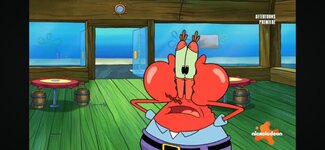
This frame from '"Arbor Day Disarray" remember me the Greenblattbob design of Mr. Krabs in "Fear of a Krabby Patty"
 

Attachments

  • Screenshot_20231121_230154_com.google.android.youtube.jpg
    Screenshot_20231121_230154_com.google.android.youtube.jpg
    849 KB · Views: 15
I thought it was sort of a transition season-half that looks 50/50 TV/Tablet
When you mentioned 'season-half' I remembered the first episode of season 10 and I think which is a mix between 9B and 10-12.

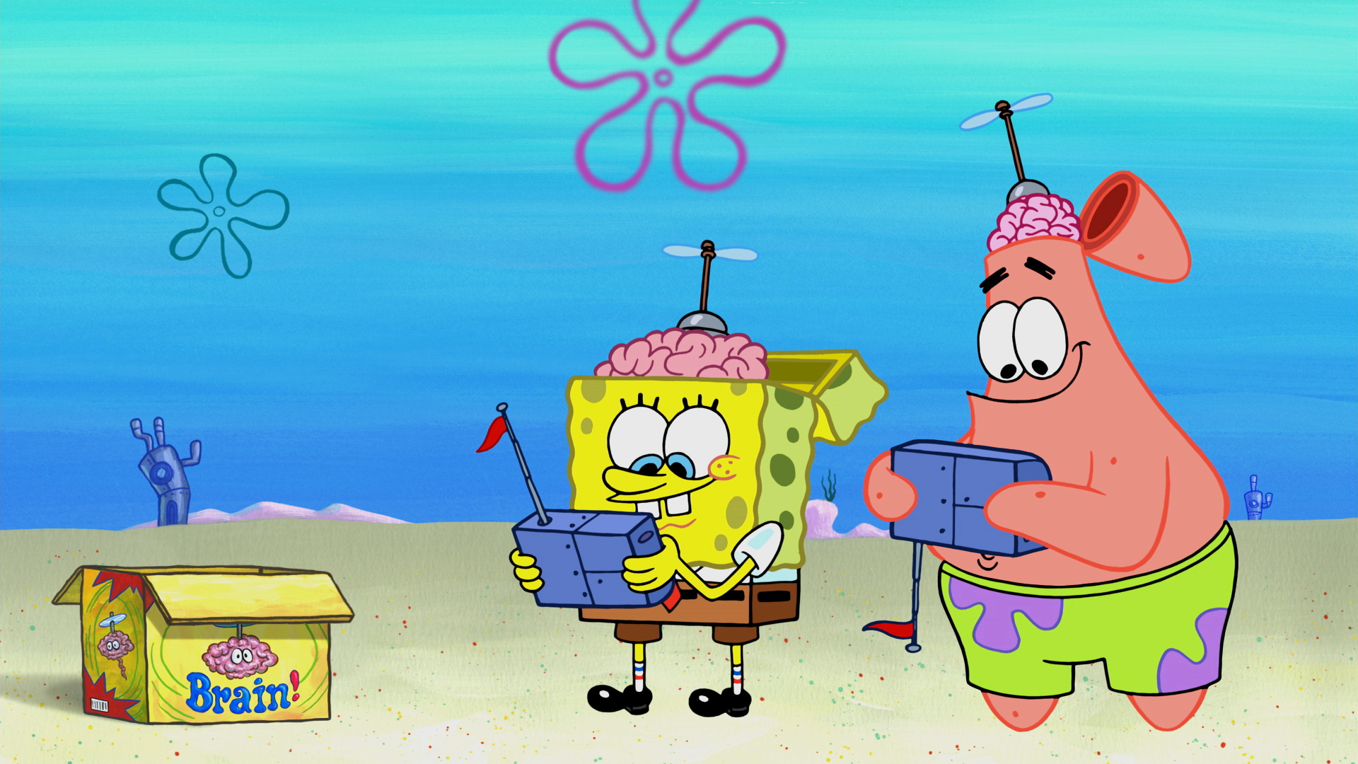
NICKELODEON_SPONGEBOBSQUAREPANTS_205_RAW_723064_1920x1080.jpg
 
Am I the only one who thinks The Lost Mattress has a season 3 vibe?
 
I don't know why but season 4 feels more like a continuation of season 2 then it does to 3, it feels more like season 2, especially since it borrowed a lot of jokes from Early season 2, and the thick outlines
download - 2023-11-23T184749.573.jpg

It's as if instead of trying to emulate Season 3's success, the new writers watched a couple Season 2 episodes to get the idea.
download - 2023-11-23T185207.840.jpg
Also, I noticed that Enemy in Law is the same Pseudo-PaleBob as Pranks A Lot.
 
Last edited:
and Post Movie music and Backdrops.

Also, in the Italian Dub Claudio Moneta (the dubber of SpongeBob in Italy) change a little bit the voice of SpongeBob,making it more childish and exaggerated.
 
Also, in the Italian Dub Claudio Moneta (the dubber of SpongeBob in Italy) change a little bit the voice of SpongeBob,making it more childish and exaggerated.
Interesting, I didn't know some dubs also had a post-movie voice change. but I think that's a discussion for a more relevant thread.
 
Post Movie to Post Sequel's transition was not as severe/noticable as Pre Movie to Post Movie's

Many of Post Sequel share the same aspects and traits as Post Movie. such as Music, Assets, and Colors. which is why I think it's absurd that people are angry about modern spongebob being too colorful, almost as if they're angry that they are using better technology.
 
SpongeBob was always supposed to be colorful, the only reason it wasn't as much then was because of cel animation, and scans.
This was Help Wanted's Model Sheet.
download - 2023-11-23T190310.118.jpg
 
Also, in the Italian Dub Claudio Moneta (the dubber of SpongeBob in Italy) change a little bit the voice of SpongeBob,making it more childish and exaggerated.
In the spanish dub, the dubber also has a different voice tone, they obviously noticed the Spongebob's personality change, and adecuated the voice tone
 
Back
Top