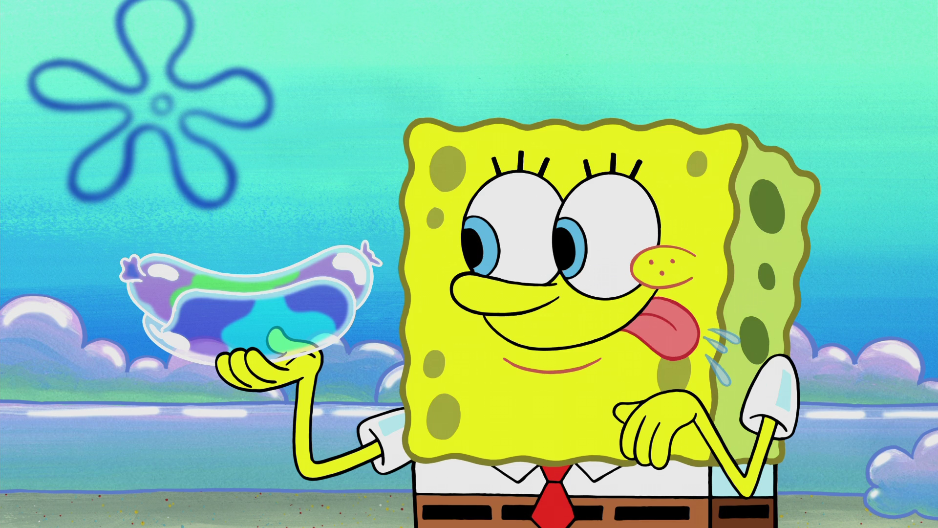
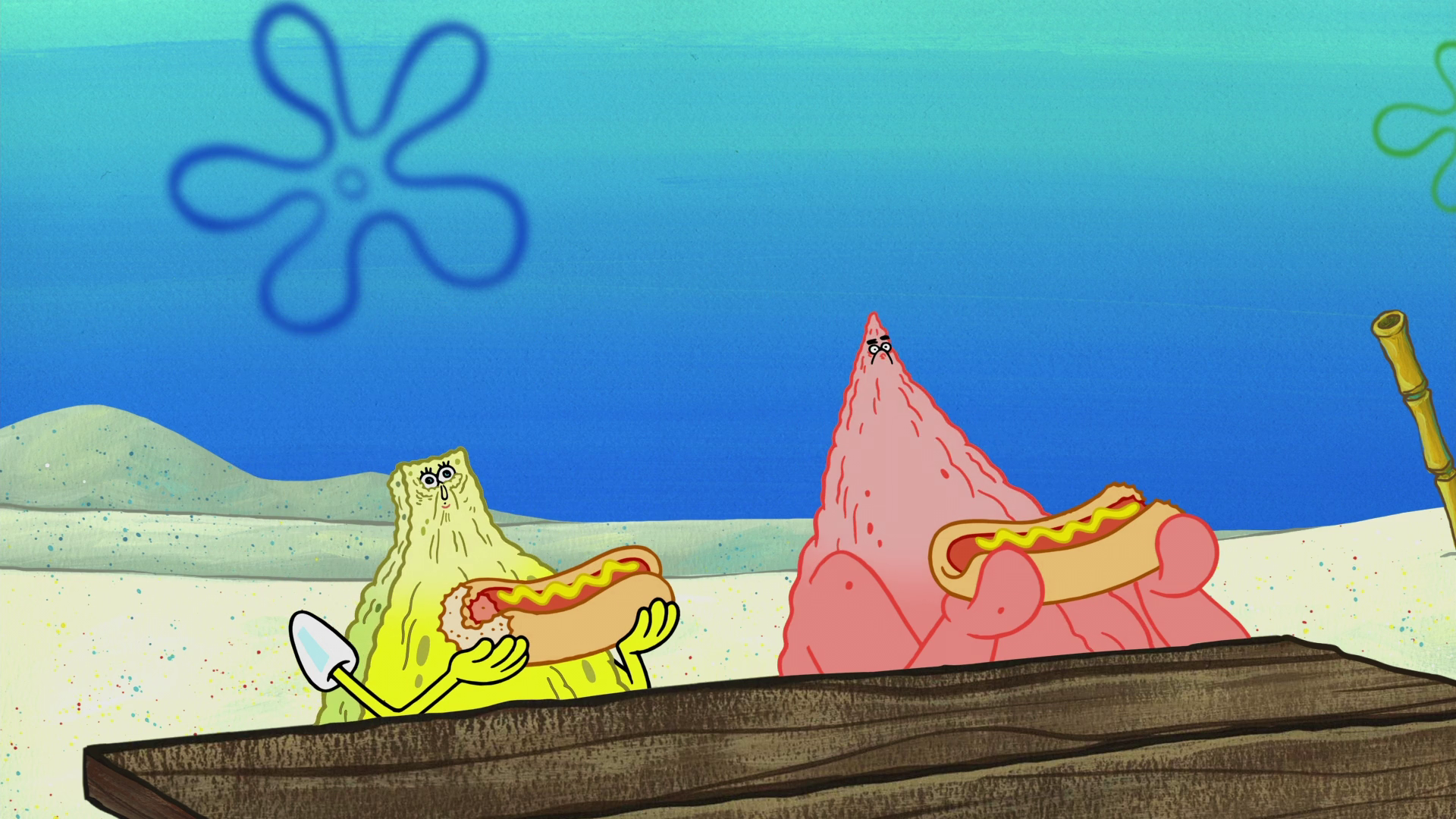
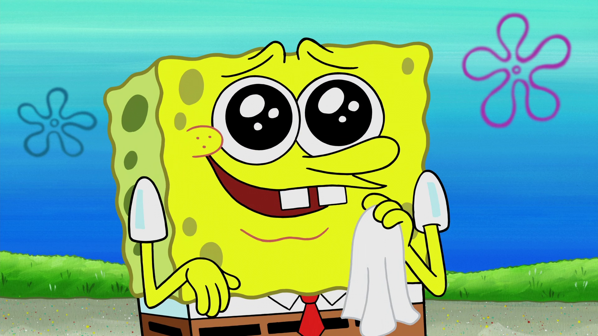
Visual Artifacts Found in SpongeBob

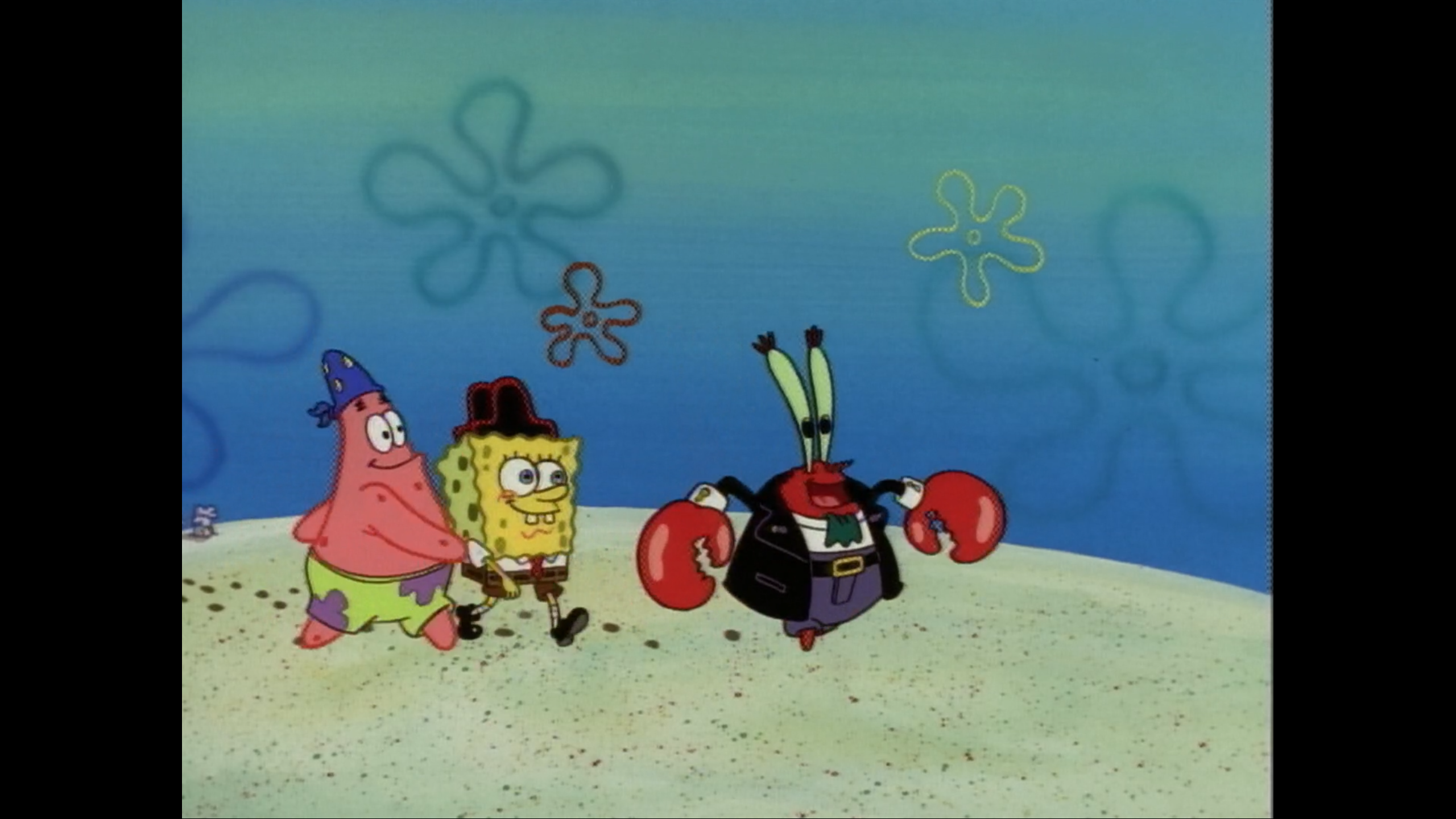
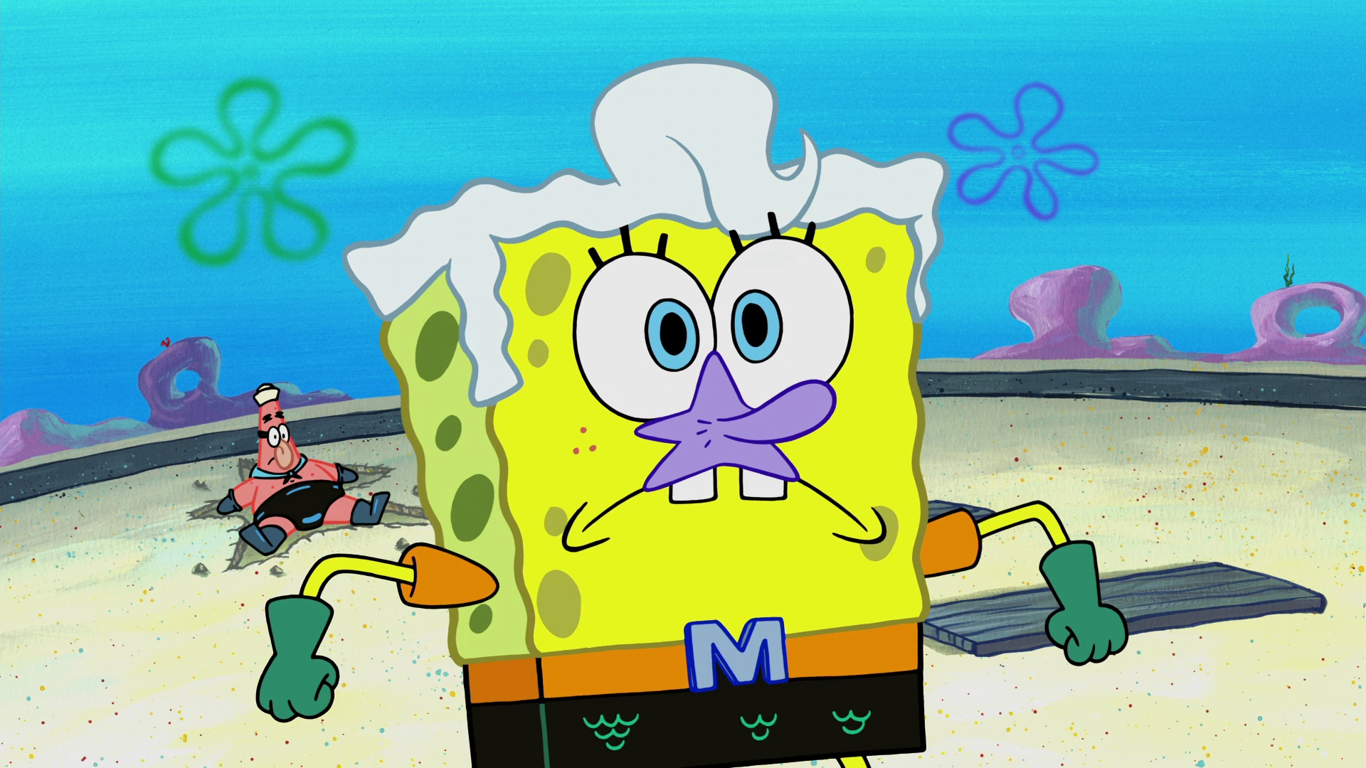
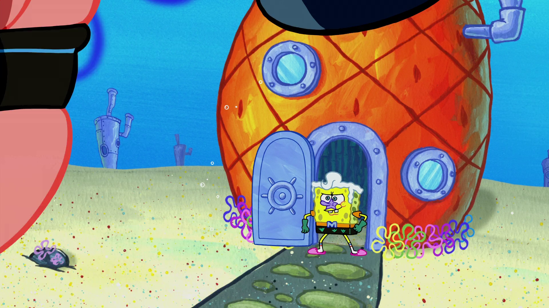
Anyone else seen Mermaid Man and Barnacle Boy III without dot crawl and CRT artifacts?
Nope, not that I know of. Even Netflix has dot crawl.

spongebranch said:
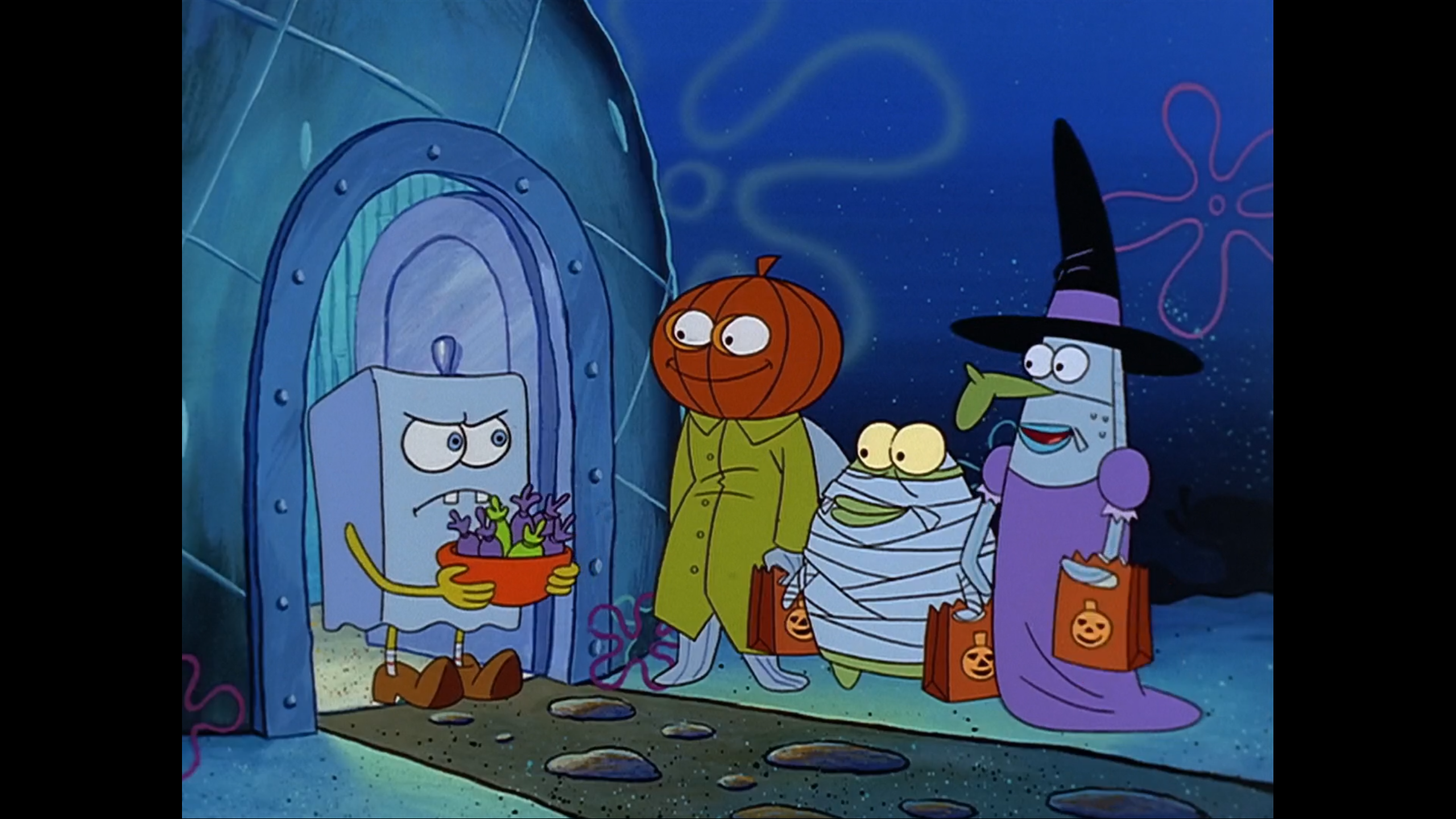
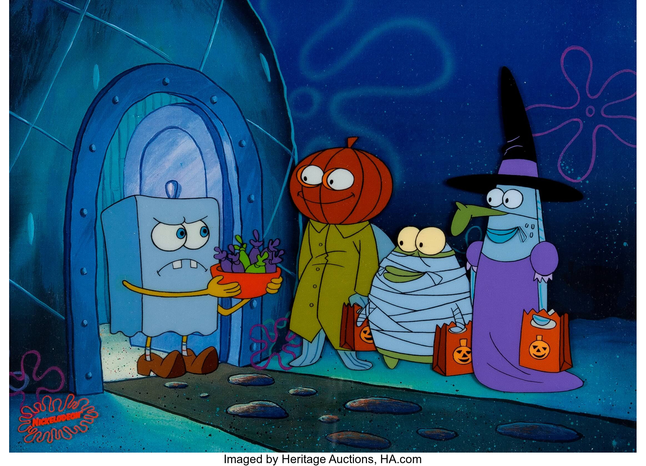
I honestly think that the Season 1 DVD's transfers have to be the worst season boxset transfers because I find the paleness on every episode in Season 2's boxset to be nowhere near as distracting as dot crawl and CRT rainbow artifacts (only Christmas Who?, Dumped, and Mermaid Man and Barnacle Boy III have CRT artifacts (the first 2 don't have them for the entire episode) on the Season 2 DVD compared to Jellyfishing, Plankton!, Naughty Nautical Neighbors, Boating School, Pizza Delivery, Home Sweet Pineapple, Mermaid Man and Barnacle Boy, Pickles, Nature Pants, Opposite Day, Squidward the Unfriendly Ghost, The Chaperone, Employee of the Month, Scaredy Pants, I Was a Teenage Gary, Sleepy Time, Suds, Arrgh!, Rock Bottom, Hooky, and Mermaid Man and Barnacle Boy II having CRT artifacts on the Season 1 DVD)

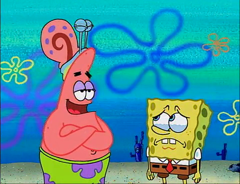
I just discovered that the US releases of older SpongeBob episodes have thin black bars added on the sides and non-USA transfers have those bars removed, revealing more of the screen.

(example) Germany (it's hard to tell if there's dot crawl because this is a compressed JPG
270.png
USA
I think that the reason a lot of Season 1 episodes look bad is because the video masters weren't handled well, or something like that.

spongebranch said:
31a_Patrick.jpg
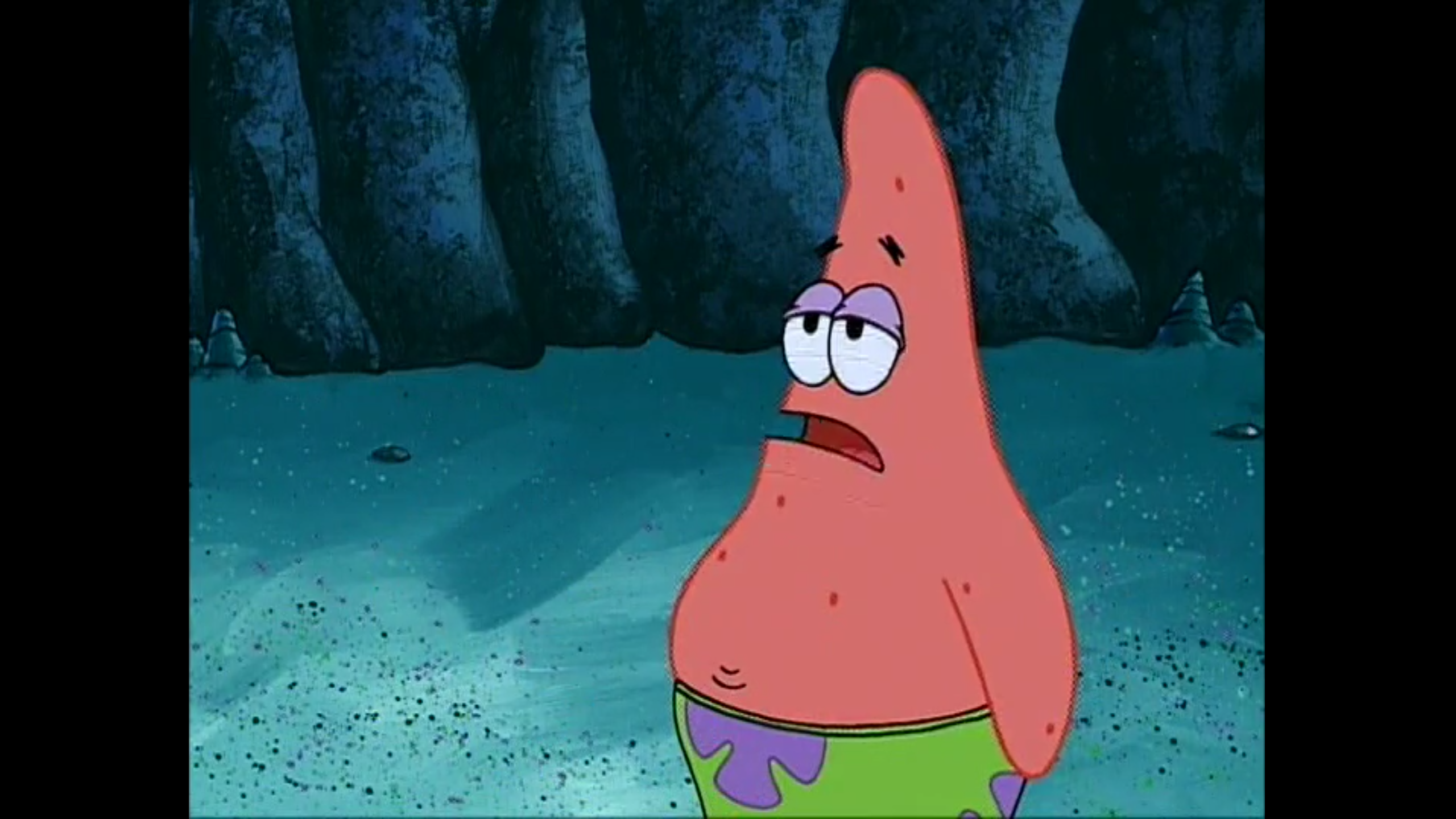
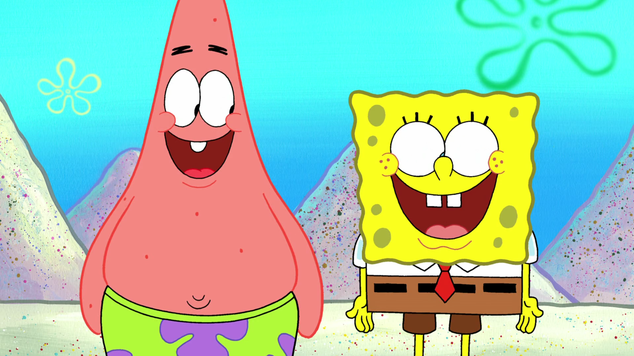
a screenshot of Mermaid Man and Barnacle Boy III without dot crawl and CRT artifacts on the German Spongepedia. (it's a JPG and there are some pixels around Patrick's outline from compression)
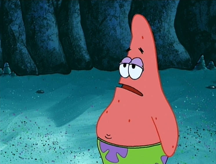
I think that's the first image I've seen of the episode without CRT artifacts! At least I think there's no CRT artifacts. I'll screenshot the episode online (which has PaleBob), just to try to compare the two images, to make sure it is clean.

31a_Patrick.jpg

Screenshot2018111719.png


Looking closer, the first image looks very clean.
 
It took me this long to realize that the HD Seasons (especially Season 9a) appear badly oversaturated in the USA compared to the international prints. Amazon Instant Video has the saturation toned down like the PAL prints do.

473.png
USA prints
SpongeBob HD PAL desaturation.png
non-USA prints (from Nickelodeon Sweden)
 
spongebranch said:
It took me this long to realize that the HD Seasons (especially Season 9a) appear badly oversaturated in the USA compared to the international prints. Amazon Instant Video has the saturation toned down like the PAL prints do.

473.png
USA prints
attachicon.gif
SpongeBob HD PAL desaturation.png
non-USA prints (from Nickelodeon Sweden)
US SpongeBob hurts my eyes
 
MY CHOCOLATE LEG! said:
US SpongeBob hurts my eyes
I bet they changed it in the non-USA prints so it wouldn't hurt those sensitive children's eyes. It was probably a transferring error on Nickelodeon USA's part and it's so bothersome how all of Season 9 and I think 10 and 11 have this as well.
 
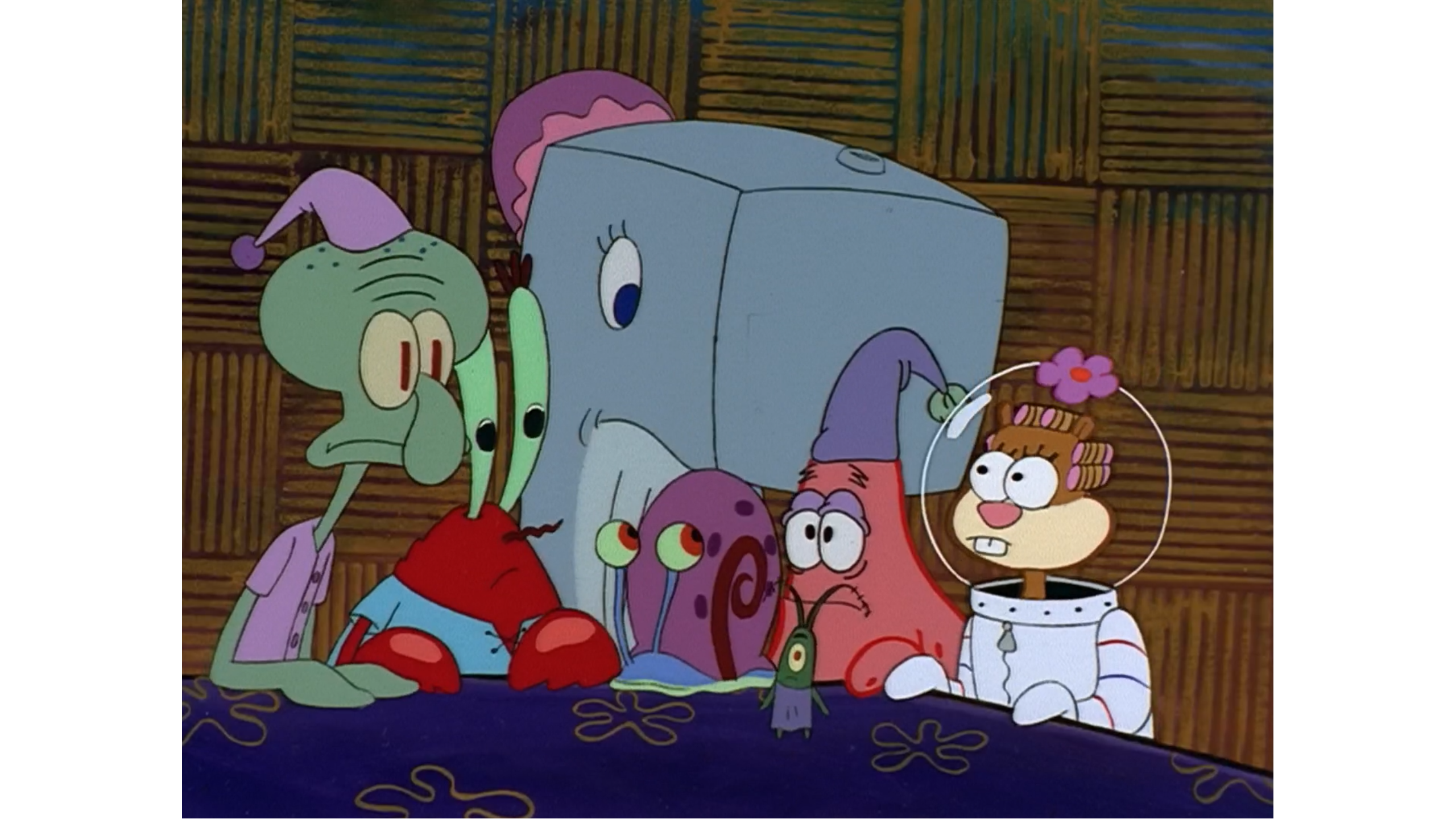
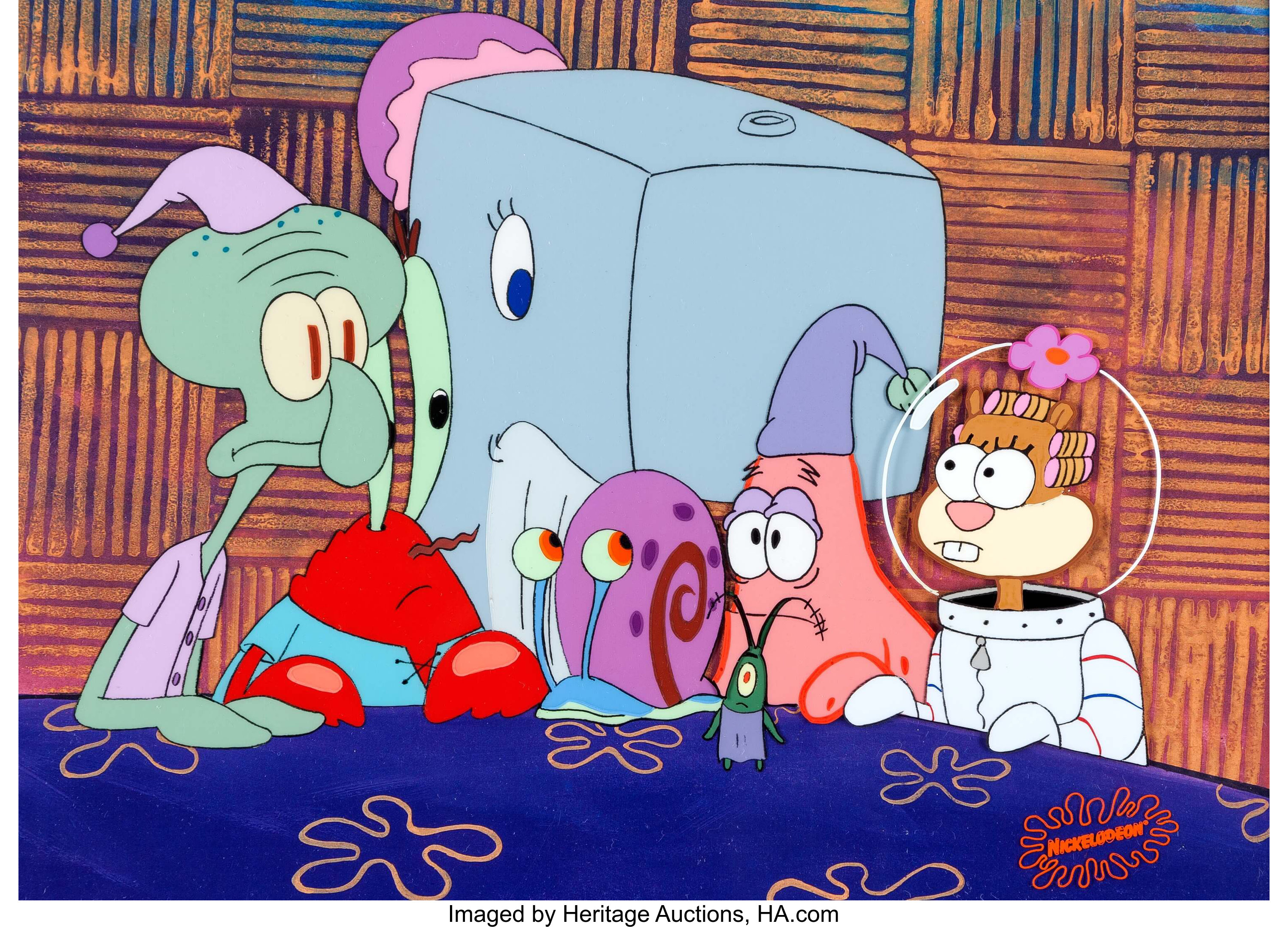
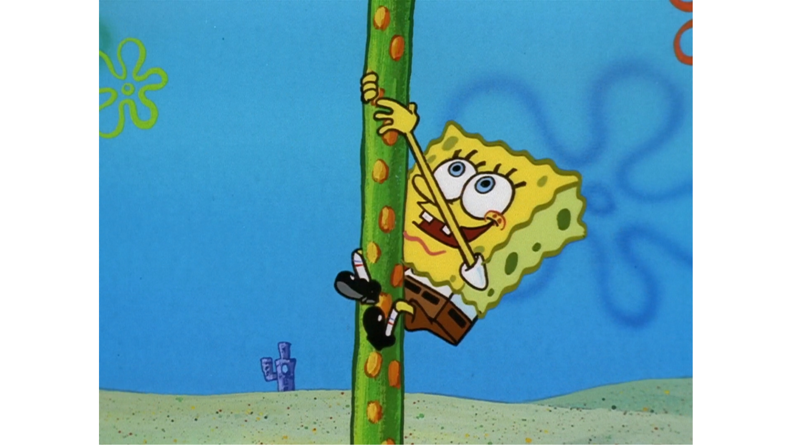
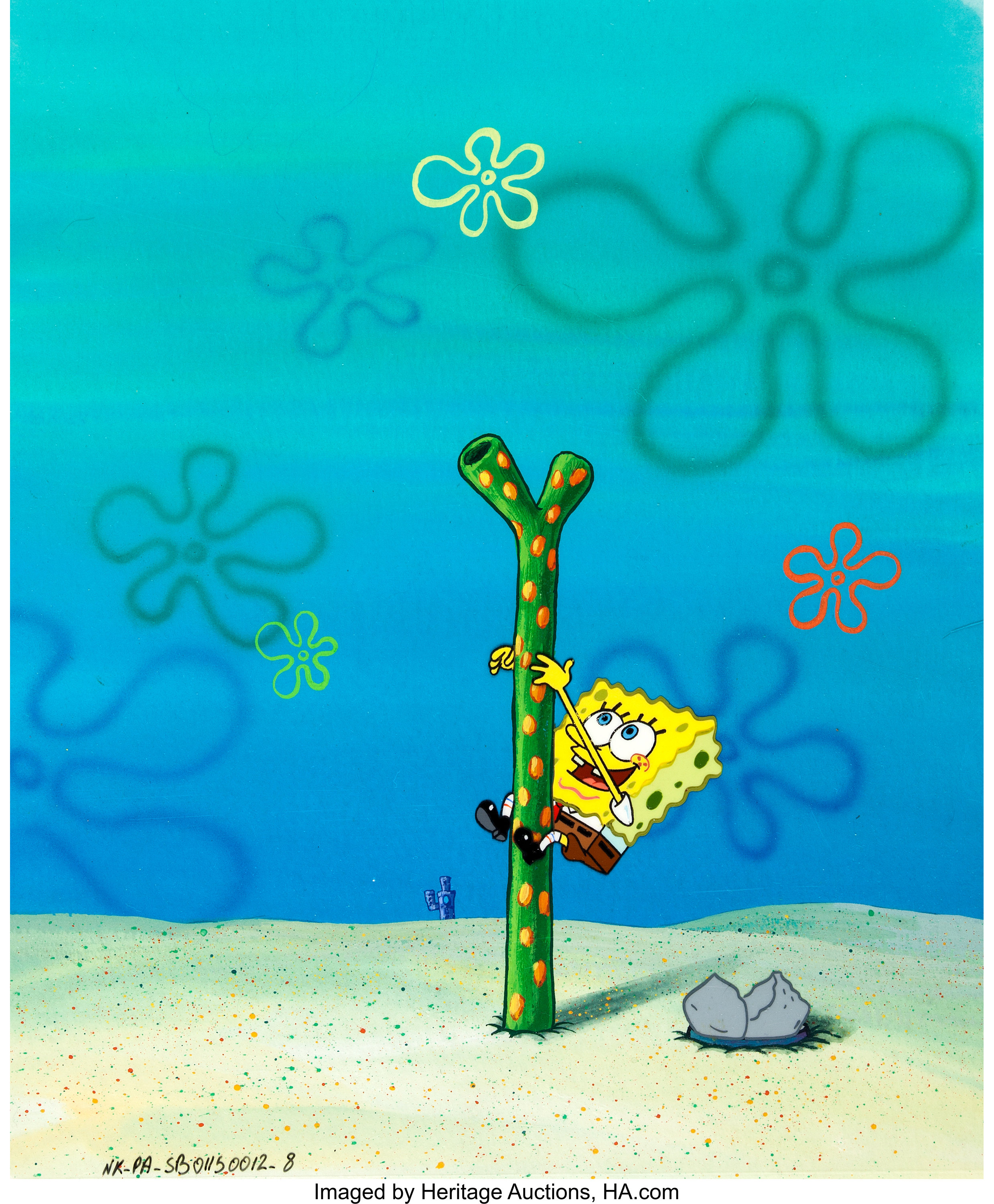
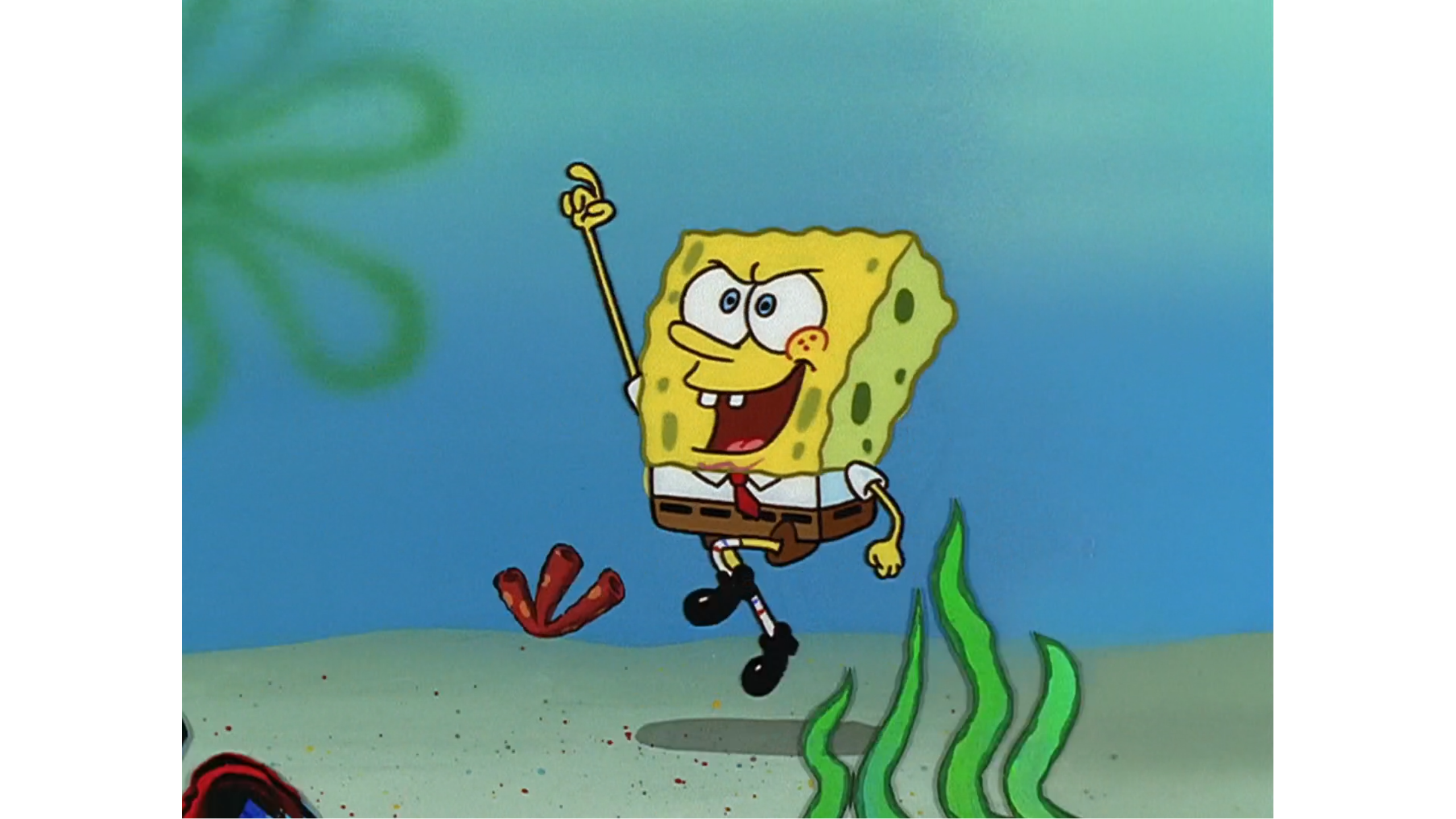
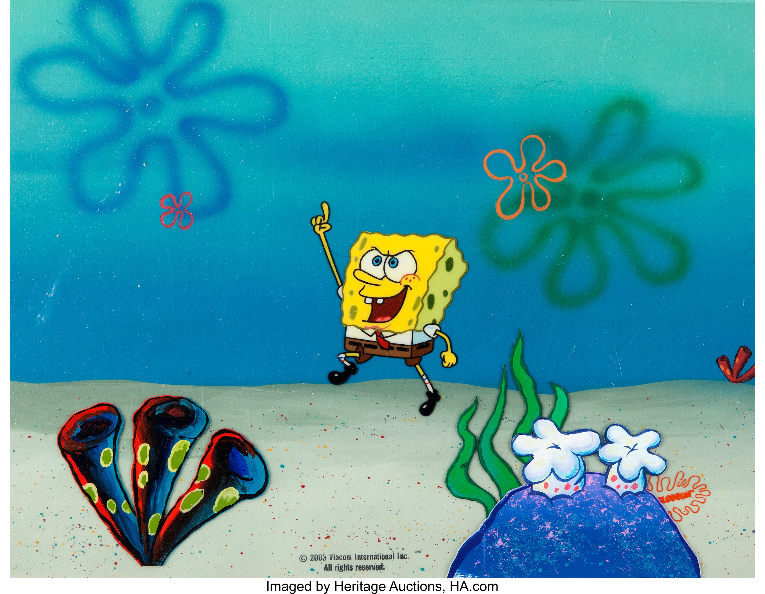
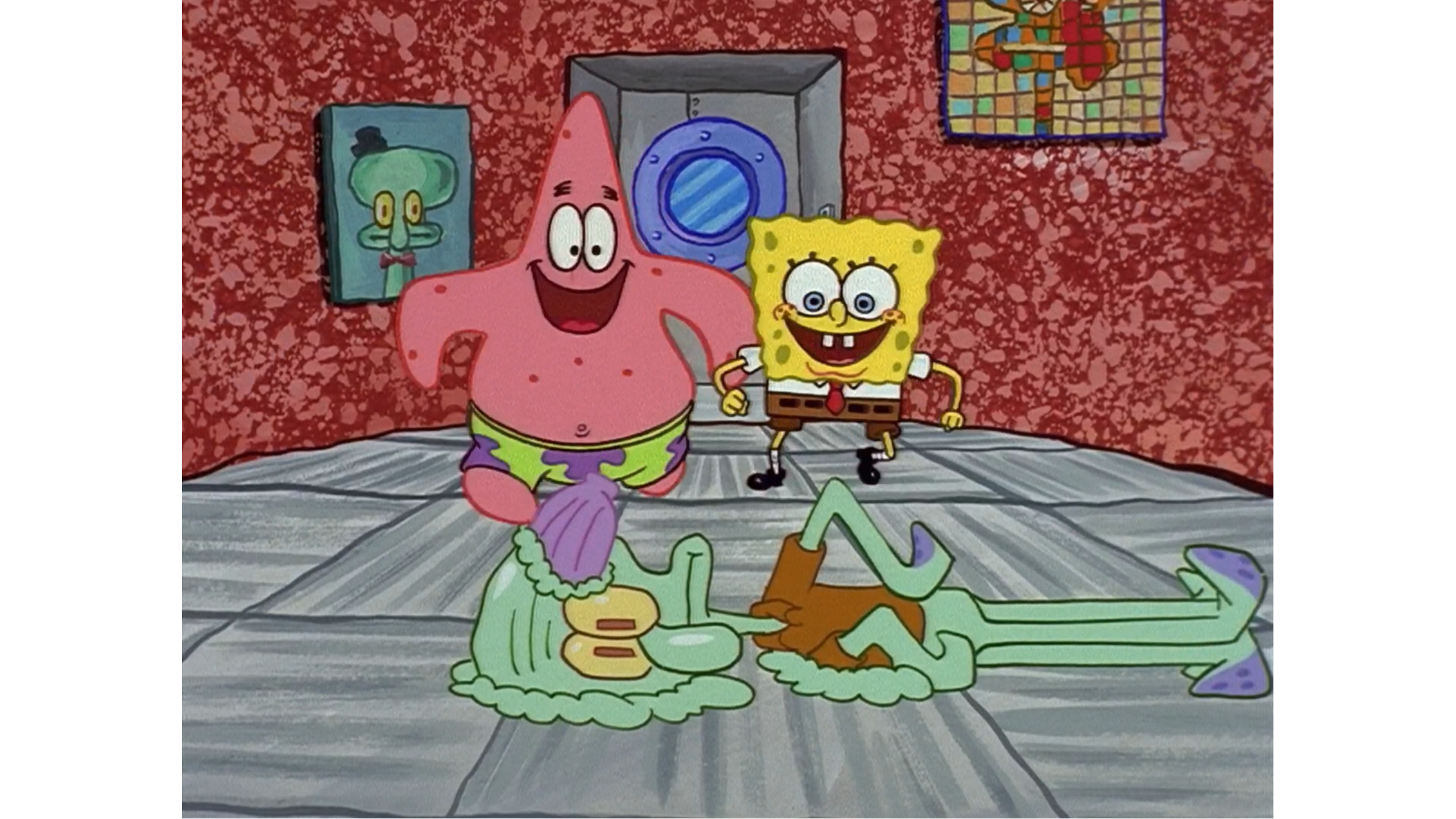
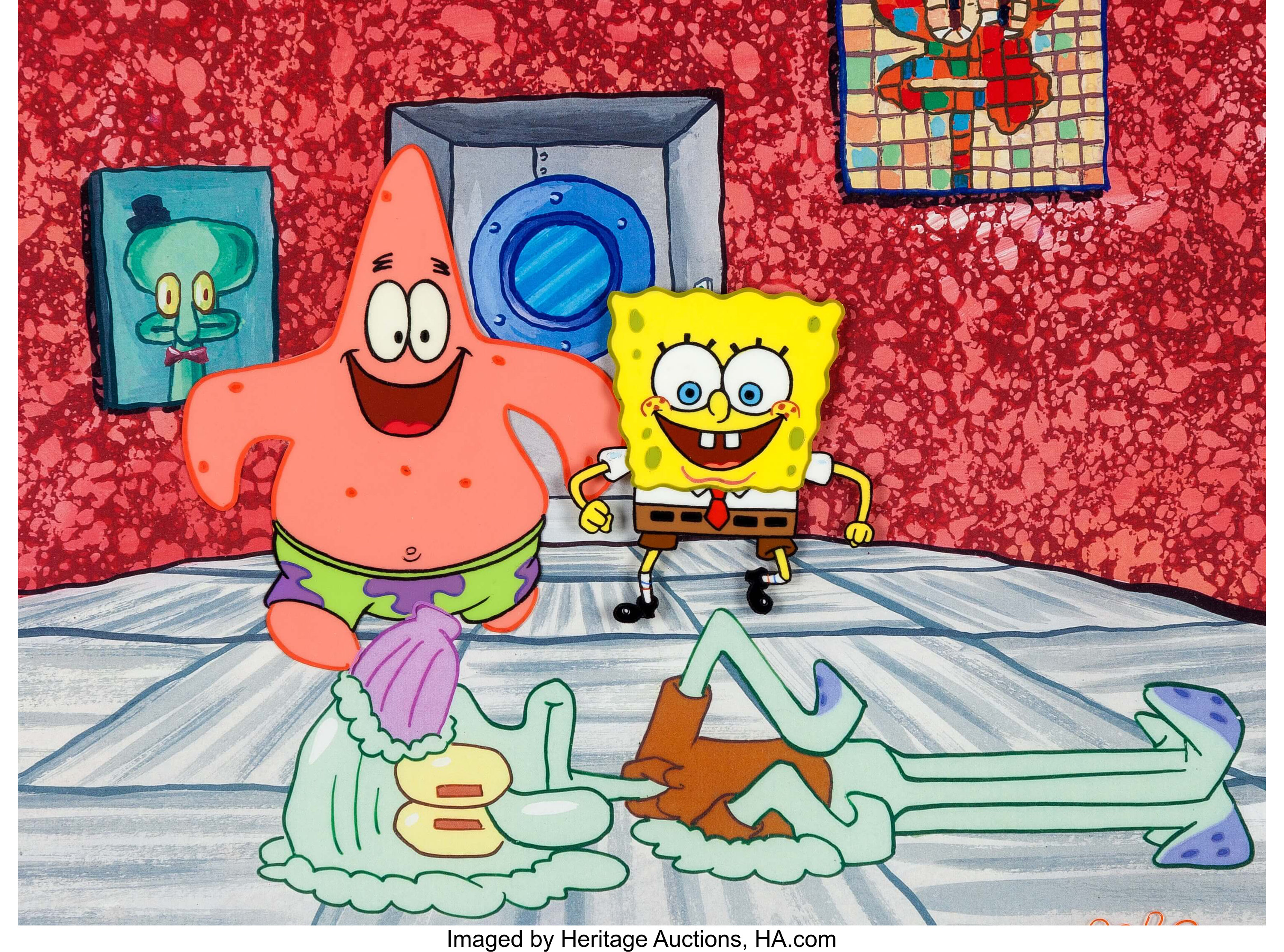
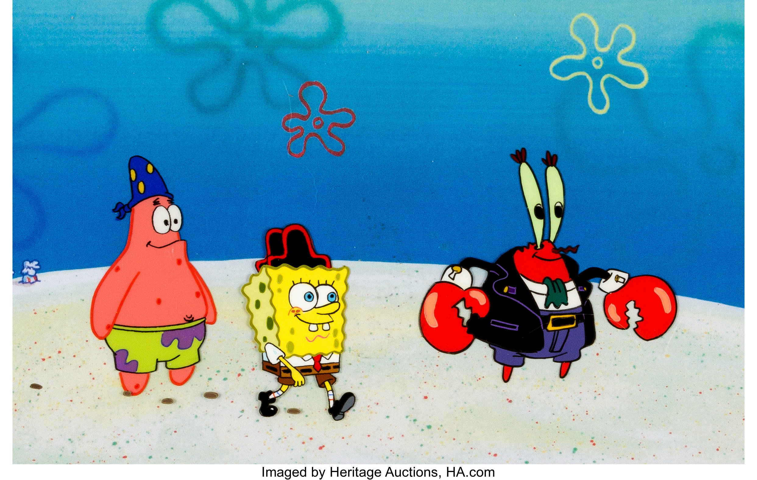
Hey @[member='spongebranch'], @[member='Original Raw and Uncut'], or someone else, do you guys notice that the Season 1 cels appear very different in color than other sources? Here are a few examples of what I mean. I'll compare with the original production cels. I'll also use the 'HD remasters' of the Season 1 episodes from Amazon/iTunes. The quality differences will be pretty noticeable by the way :P
The order of the images goes from the 'remaster', and then the original cels.
5dcScreenshot2018111820.png

lf1.jpeg


Screenshot2018111821.png

lf5.jpeg


3fdScreenshot2018111821.png

lf.jpeg


f9eScreenshot2018111821.png

lf2.jpeg


b88Screenshot2018111821.png

lf4.jpeg


d29Screenshot2018111821.png

lf6.jpeg
That's really wierd. The cels obviously are higher quality, and the colors seem more realistic and the colors are more in line with early Season 2. I guess that since Season 1 was recorded with video masters, the dynamic range and saturation was reduced greatly, compared to the original cels.

Original Raw and Uncut said:
Anyone notice how the season 1 episode "Arrgh!", has a red tint:

Compass.png
Yep, I noticed that when watching 'Arrgh!' and 'Rock Bottom'. Patrick looks more on the red side, Mr. Krabs is kind of pink-ish, while SpongeBob is a very light yellow (To my eyes). In my post above, when you look at the cel compared to the episode image, it has no issues, since it's the cel. Many say that Season 1 has darker animation than the other seasons, but I think it's only like that because it was photographed with 35mm film cameras. With the other seasons, even the newer ones (10, 11, and Season 12 which just started) the drawings were scanned, and inked digitally on computers, so those seasons don't look as dull as Season 1.

It was confirmed by Adam Paloian that SpongeBob is still hand-drawn on paper, and inked digitally :D
https://mobile.twitter.com/adampaloian/status/1059277368844464128
 
LARRY22 said:
Hey @[member='spongebranch'], @[member='Original Raw and Uncut'], or someone else, do you guys notice that the Season 1 cels appear very different in color than other sources? Here are a few examples of what I mean. I'll compare with the original production cels. I'll also use the 'HD remasters' of the Season 1 episodes from Amazon/iTunes. The quality differences will be pretty noticeable by the way :P
The order of the images goes from the 'remaster', and then the original cels.
5dcScreenshot2018111820.png
lf1.jpeg
Screenshot2018111821.png
lf5.jpeg
3fdScreenshot2018111821.png
lf.jpeg
f9eScreenshot2018111821.png
lf2.jpeg
b88Screenshot2018111821.png
lf4.jpeg
d29Screenshot2018111821.png
lf6.jpeg
That's really wierd. The cels obviously are higher quality, and the colors seem more realistic and the colors are more in line with early Season 2. I guess that since Season 1 was recorded with video masters, the dynamic range and saturation was reduced greatly, compared to the original cels. Yep, I noticed that when watching 'Arrgh!' and 'Rock Bottom'. Patrick looks more on the red side, Mr. Krabs is kind of pink-ish, while SpongeBob is a very light yellow (To my eyes). In my post above, when you look at the cel compared to the episode image, it has no issues, since it's the cel.
I always noticed that. I wonder if the international transfers of season 1 used the raw digital files (knowing that they were partially assembled on digital.), hence how they look so clean (and the grain tends to be less detailed)
 
Anyone notice how Plankton's throat is purple in the last few episodes of season 4:


His throat is normal in the beginning of Friend or Foe:


.....but then it's purple again at the end of the episode:

This issue isn't fixed until the episode Spy Buddies:
 
Original Raw and Uncut said:
Anyone notice how Plankton's throat is purple in the last few episodes of season 4:


His throat is normal in the beginning of Friend or Foe:


.....but then it's purple again at the end of the episode:

This issue isn't fixed until the episode Spy Buddies:
obvious animation error as I don't even know what made them choose this. If they did this in the flashbacks in Friend or Foe that would do some real damage to the continuity to depict as if Plankton's mouth was always purple.

Also I don't even know what episode has the worst transfer on Nickelodeon USA: The Chaperone/Employee of the Month or Frankendoodle

but then again i'm safely saying Frankendoodle because the dot crawl is so massive you can see it from several feet away even on a CRT TV screen. The Chaperone/Employee of the Month look so bad that they actually look like a VHS. (VHS artifacts include warped picture, dull colors, noise, heavy grain, etc.)
 
spongebranch said:
obvious animation error as I don't even know what made them choose this. If they did this in the flashbacks in Friend or Foe that would do some real damage to the continuity to depict as if Plankton's mouth was always purple.

Also I don't even know what episode has the worst transfer on Nickelodeon USA: The Chaperone/Employee of the Month or Frankendoodle

but then again i'm safely saying Frankendoodle because the dot crawl is so massive you can see it from several feet away even on a CRT TV screen. The Chaperone/Employee of the Month look so bad that they actually look like a VHS. (VHS artifacts include warped picture, dull colors, noise, heavy grain, etc.)
I kinda like the bad quality in Franendoodle, it makes me feel nostalgic. It makes me think back to that one night way back about 10 years ago, when nick reran it, and I thought there was something wrong with the tv, because of the bad quality. Same with Procratination, the bad quality makes me think about my childhood.
 
Original Raw and Uncut said:
I kinda like the bad quality in Franendoodle, it makes me feel nostalgic. It makes me think back to that one night way back about 10 years ago, when nick reran it, and I thought there was something wrong with the tv, because of the bad quality. Same with Procratination, the bad quality makes me think about my childhood.
so I can safely say that The Chaperone/Employee of the Month are worse.
 
I understand that in season 1, the staff wasn't used to drawing the characters and stuff. But the animation in certain episodes is so sloppy it's actually bothersome. Almost to the point, if I were a nick exec, I would tell the staff to re-draw it.

Good episodes, ::dolphin noise::y animation:


Look at how pointy everything is, it looks like somebody scribbled it in:


Sheldon's arms are so tiny:
https://www.sbmania.net/pictures.php?img=P7Un0p9c2ejR49kCFoXdGqly9gQGpH5eYNSf2cGuCWM=


I Was a Teenage Gary has the ugliest animation I've ever seen in the show:
https://www.sbmania.net/pictures.php?img=nUa3tpjVpJaO30/0WWBzz4B3BTwMpuzU4DpiyYl3nIw=

https://www.sbmania.net/pictures.php?img=bwbMRYbSfMbqijowCQLwePn5cZ3X1ijLIAD2LmdlgXM=

Thankfully, the animation in the second half of Season 1 becomes less of an eye sore:
https://www.sbmania.net/pictures.php?img=a6xuSk0c4XeKt0DBXxw6Gs3ir0L+Fu3bwNB9237acIQ=

Hooky & Mermaidman & Barnacleboy II look like a cel animated version of season 2:
https://www.sbmania.net/pictures.php?img=OQrbBqBcR5NiveM+03z+bCeYz8xcn5Olo9WKuJxVNAc=

https://www.sbmania.net/pictures.php?img=zn9sLTzxaQnOcC2OA4xuYOlHCpYxqZ9m55LHziK5IB8=

These episodes actually use the same models as episodes such as Big Pink Loser:
https://www.sbmania.net/pictures.php?img=tulEBmKbm4Pn67SlaTOsTsUMQFPADoZQbsGjWbLFCW4=

It's like an electronically colored version of Hooky
 
it took me this long to realize how Season 9a's colors look poorly calibrated compared to the non-USA prints and Amazon Instant Video
left is from this site's pictures section (the USA prints) and the right is from the non-USA prints and Amazon Instant Video
(from the SpongeBob Wikia)
179aqualitycomparison.png
179bqualitycomparison.png

180aqualitycomparison.png
180bqualitycomparison.png

181aqualitycomparison.png

181bqualitycomparison.png

182aqualitycomparison.png

182bqualitycomparison.png

183aqualitycomparison.png

183bqualitycomparison.png

184aqualitycomparison.png

184bqualitycomparison.png

185qualitycomparison.png

186aqualitycomparison.png

186bqualitycomparison.png

187aqualitycomparison.png

187bqualitycomparison.png

188aqualitycomparison.png

189qualitycomparison.png
I don't have Yeti Krabs' title card from Amazon Instant Video to compare though, but you can really see the difference now. Reds being undersaturated, yellows being oversaturated, whites appearing slightly gray in some cases, pinks being oversaturated, etc.
 
spongebranch said:
it took me this long to realize how Season 9a's colors look poorly calibrated compared to the non-USA prints and Amazon Instant Video
left is from this site's pictures section (the USA prints) and the right is from the non-USA prints and Amazon Instant Video
(from the SpongeBob Wikia)
179aqualitycomparison.png
179bqualitycomparison.png
180aqualitycomparison.png
180bqualitycomparison.png

181aqualitycomparison.png
181bqualitycomparison.png
182aqualitycomparison.png
182bqualitycomparison.png
183aqualitycomparison.png
183bqualitycomparison.png
184aqualitycomparison.png
184bqualitycomparison.png
185qualitycomparison.png
186aqualitycomparison.png
186bqualitycomparison.png
187aqualitycomparison.png
187bqualitycomparison.png
188aqualitycomparison.png
189qualitycomparison.png
I don't have Yeti Krabs' title card from Amazon Instant Video to compare though, but you can really see the difference now. Reds being undersaturated, yellows being oversaturated, whites appearing slightly gray in some cases, pinks being oversaturated, etc.
That is most likely a color calibration error, or maybe (there is a chance) the non-USA prints of those episodes are more accurate in terms of color. I've always noticed that the USA versions of Season 9A are more saturated (especially the yellows and reds) than Seasons 9B,10,11 and 12. Here is Extreme Spots, which I screenshot from Nick.com, and then I'll use images of the other seasons from the Encyclopedia SpongeBobia Wikia and this site. I have to get Extreme Spots from Nick.com because the images on this site for the episode are squished, and ESB has LQ images for the episode.

Season 9A (Extreme Spots)-
Screenshot2018110717.png

9d3Screenshot2018110717.png

d9dScreenshot2018110717.png


Season 9B (Tutor Sauce and Food Con Castaways)-
130.png

129.png

FoodConCastaways007.png


Season 10 (Mermaid Pants and Mimic Madness)-
MermaidPants020.png

MermaidPants003.png

MimicMadness069.png


Season 11 (Bubbletown and Squirrel Jelly)-
Bubbletown002.png

Bubbletown030.png

SquirrelJelly036.png


Season 12 (FarmerBob)-
FarmerBob142.png
The colors have definitely been toned down a bit in more recent seasons. They either used darker fill tools while animating, or the color calibration has improved. I also noticed that Extreme Spots has some jagged lines compared to the newer seasons, but it makes sense since it's the first HD episode (Aside from Truth or Square, and It's a SB Christmas).


Original Raw and Uncut said:
Anyone notice how the art style changes for a few seconds in Welcome to the Chumbucket:


I noticed that too. I think the artists were trying to decide which model was better, so they used both to meet their needs.
 
LARRY22 said:
That is most likely a color calibration error, or maybe (there is a chance) the non-USA prints of those episodes are more accurate in terms of color. I've always noticed that the USA versions of Season 9A are more saturated (especially the yellows and reds) than Seasons 9B,10,11 and 12. Here is Extreme Spots, which I screenshot from Nick.com, and then I'll use images of the other seasons from the Encyclopedia SpongeBobia Wikia and this site. I have to get Extreme Spots from Nick.com because the images on this site for the episode are squished, and ESB has LQ images for the episode.
Season 9A (Extreme Spots)-
Screenshot2018110717.png
9d3Screenshot2018110717.png
d9dScreenshot2018110717.png

Season 9B (Tutor Sauce and Food Con Castaways)-
130.png
129.png
FoodConCastaways007.png

Season 10 (Mermaid Pants and Mimic Madness)-
MermaidPants020.png
MermaidPants003.png
MimicMadness069.png

Season 11 (Bubbletown and Squirrel Jelly)-
Bubbletown002.png
Bubbletown030.png
SquirrelJelly036.png

Season 12 (FarmerBob)-
FarmerBob142.png
The colors have definitely been toned down a bit in more recent seasons. They either used darker fill tools while animating, or the color calibration has improved.
I noticed that too. I think the artists were trying to decide which model was better, so they used both to meet their needs.
Color calibration error in the USA transfers or the international transfers? I’m confused.
And I thought all of Seasons 6-early Season 11 were removed from Nick.com earlier this year?
 
Color calibration error in the USA transfers or the international transfers? I’m confused.
And I thought all of Seasons 6-early Season 11 were removed from Nick.com earlier this year?
Whoops, my bad, I made a typo :P
I meant to say that I think the USA transfers for Season 9A had a color calibration errors, and the non-USA ones seemed more pleasing to the eyes, except the grayish whites.

Oh yeah, forgot to mention Nick.com recently added Extreme Spots/Squirrel Record about a couple weeks back. There are also some other S9 episodes. There aren't many Season 6-8 episodes, if any.
I think Nick USA uses RGB for color-calibration.

http://www.nick.com/spongebob-squarepants/videos/extreme-spots-squirrel-record-s9-ep1-full-episode/
 
Whoops, my bad, I made a typo :P
I meant to say that I think the USA transfers for Season 9A had a color calibration errors, and the non-USA ones seemed more pleasing to the eyes, except the grayish whites.
Oh yeah, forgot to mention Nick.com recently added Extreme Spots/Squirrel Record about a couple weeks back. There are also some other S9 episodes. There aren't many Season 6-8 episodes, if any.
I think Nick USA uses RGB for color-calibration.http://www.nick.com/spongebob-squarepants/videos/extreme-spots-squirrel-record-s9-ep1-full-episode/
It’s interesting to think that SpongeBob You’re Fired premiered in Greece and Israel before the USA and had better color calibration than the USA there.
 
Back
Top