spongebranch
Banished
- Joined
- Aug 28, 2015
- Messages
- 456
- Points
- 736
oh and Company Picnic/Pull Up a Barrell have gray whites as well. same for Kenny the Cat/Yeti Krabs.
Yeah because the saturation is turned all the way up to 100. Anyways, does anyone notice how Kenny the Cat has bad overscan issues, take a look:spongebranch said:oh and Company Picnic/Pull Up a Barrell have gray whites as well. same for Kenny the Cat/Yeti Krabs.
Wasn't that overscan fixed in non-USA airings or Nickelodeon USA?Original Raw and Uncut said:Yeah because the saturation is turned all the way up to 100. Anyways, does anyone notice how Kenny the Cat has bad overscan issues, take a look:
Notice how Mr. Krabs eyelashes are cut off:
The top of the hats also cut off at the edge of the screen:
Half of Patrick's hat is gone again too (It's as if the episode's file was zoomed in)
Spongebob transformation into a heart, the edges are chopped off again:
The top of the window also cuts off:
Sandy's flower is halfway visible:
https://www.sbmania.net/pictures.php?img=XV+Vv5AbETxW1IUPRWH42vlzhyEhl2ACoRzpm5BVx0Y=
The overscan is a problem with the actual episode and not the US transfer. I remember watching the Greek version of this in 2013, and it still had the overscan problemspongebranch said:Wasn't that overscan fixed in non-USA airings or Nickelodeon USA?
not to mention how bad the saturation is in SpongeBob You're Fired. It actually hurts my eyes.
at least in Greece KTC didn't have the grayish whites issue.Original Raw and Uncut said:The overscan is a problem with the actual episode and not the US transfer. I remember watching the Greek version of this in 2013, and it still had the overscan problem
Even though this isn't a visual artifact, anyone notice that in some post-movie episodes Tom Kenny sounds like he has a cold,which happens VERY seldom, especially in the season 7 episode Yours, Mine, and Mine. In Jailbreak, Spongebob also sounds like he has a cold. Watch this Sponge Out of Water clip, Spongebob sounds like he has strep throat:
https://www.youtube.com/watch?v=69sa-jYk444
they definitely still have the raw international prints.LARRY22 said:Adam Paloian made a post a few days ago on Twitter responding to someone about having the original film and such for each episode, so that could be another sign that they have preserved their raw original studio prints, camera negs, and animation files for older episodes.
https://mobile.twitter.com/doodladoo/status/1066863418743947264
Nowadays they use computers to broadcast episodesspongebranch said:Digital Betacam tapes can store digital data and i'm sure Nickelodeon still uses them to broadcast.
Plus Betacam tapes, Digital Betacam tapes, Betamax tapes and magnetic tape reels don't degrade (especially not within 15-20 years) because they are made with a lot more expensive magnetic tape materials unlike VHS tapes which are made from incredibly cheap magnetic materials, so it's rather insulting to say they use VHS for broadcast.
technically digital beta machines can be hooked up to computers and they can copy files from digital beta tapesOriginal Raw and Uncut said:Nowadays they use computers to broadcast episodes
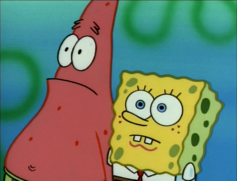
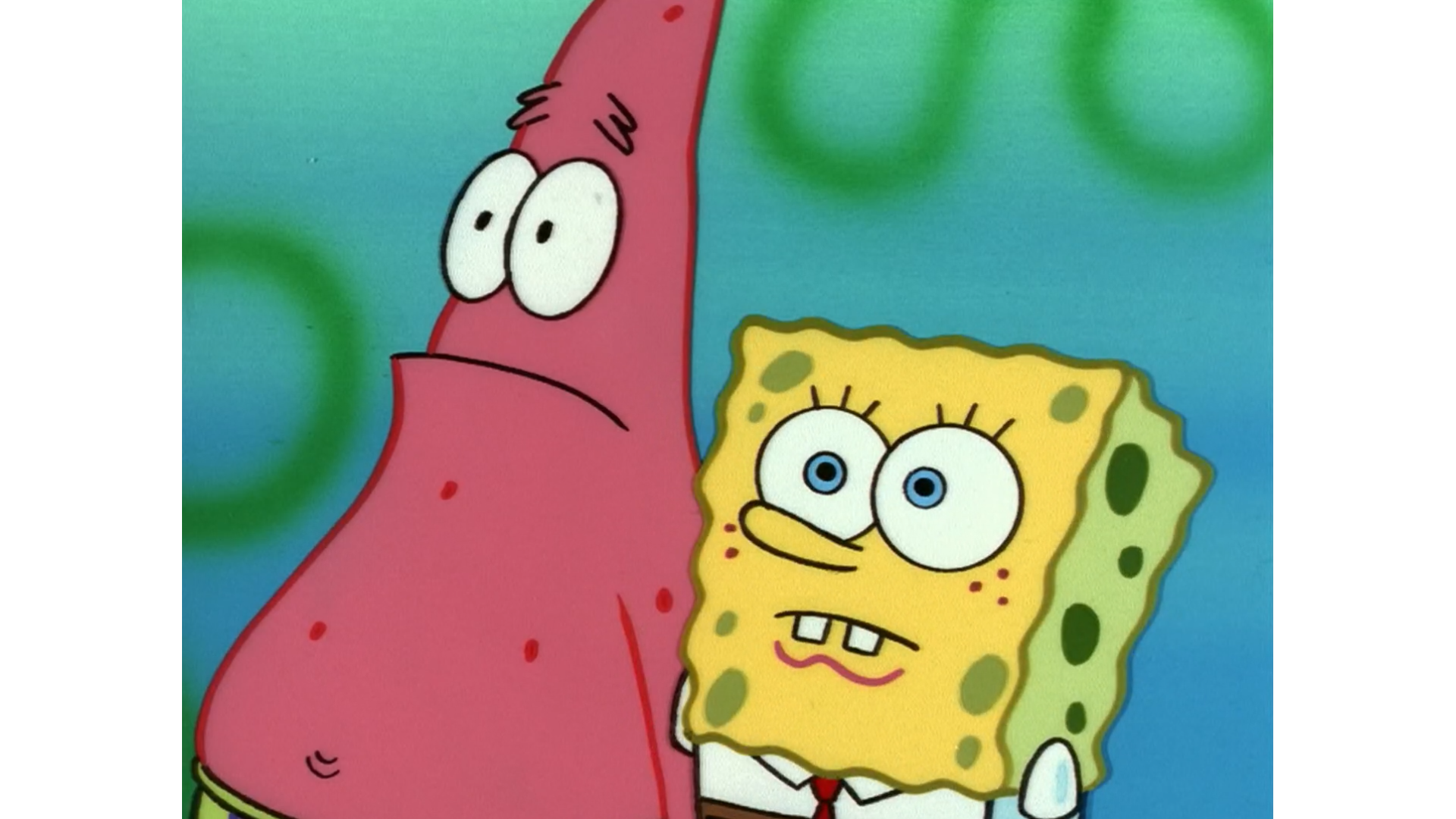
Is it just me, or does the last image look incredibly washed out? Especially Sandy's suit and fur. Maybe that was an error?Original Raw and Uncut said:Yeah because the saturation is turned all the way up to 100. Anyways, does anyone notice how Kenny the Cat has bad overscan issues, take a look:
Notice how Mr. Krabs eyelashes are cut off:
The top of the hats also cut off at the edge of the screen:
Half of Patrick's hat is gone again too (It's as if the episode's file was zoomed in)
Spongebob transformation into a heart, the edges are chopped off again:
The top of the window also cuts off:
Sandy's flower is halfway visible:
https://www.sbmania.net/pictures.php?img=XV+Vv5AbETxW1IUPRWH42vlzhyEhl2ACoRzpm5BVx0Y=
Maybe it is a contrast error.LARRY22 said:Who else finds it weird that the DVD/TV versions of Season 1 have different colors than the remastered versions on Amazon/iTunes? Here's one example, from Texas. The first image is from @[member='Original Raw and Uncut'], from this thread (Page 18), and for the second one, I screenshot the image from Amazon Prime Video.


The colors in the second one seem a lot more natural, and has a higher dynamic range, more detail, and just more pleasing. Patrick looks pretty orange-ISH, while SpongeBob looks kind of yellow with a small tint of green (but not that bad or noticeable). They sky looks very dark in the first one too.
Is it just me, or does the last image look incredibly washed out? Especially Sandy's suit and fur. Maybe that was an error?
Those episodes look normal. Minus a few dot crawls, Season 5 and Season 8 are the only seasons of the show where every episode looks normalspongebranch said:I wonder if anyone has screenshots of what all of Season 9a looks on Amazon Instant Video compared to the screenshots on SBMania. (not just the title cards)
Plus Rise and Shine/Waiting/Fungus Among Us has SBYF-tier grayish whites.
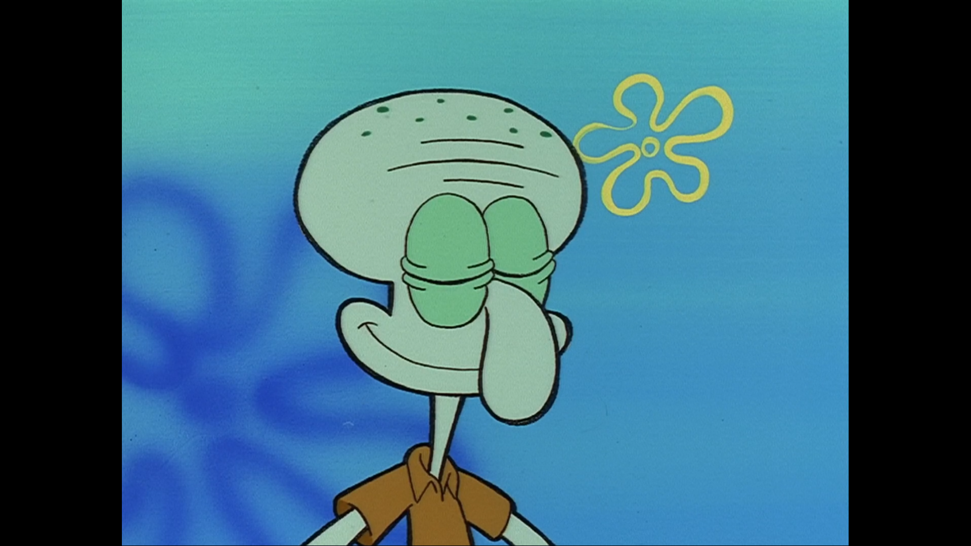
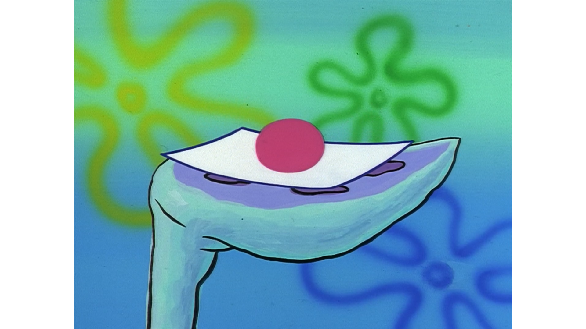
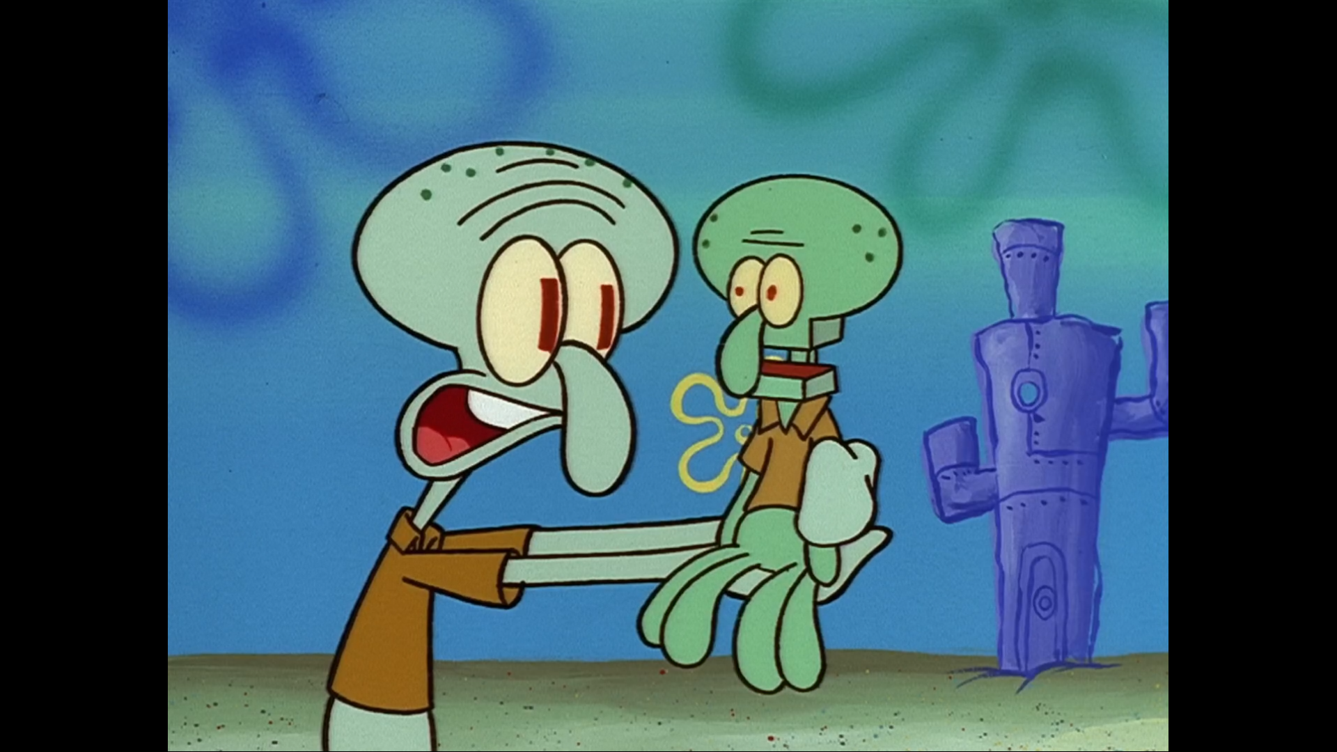
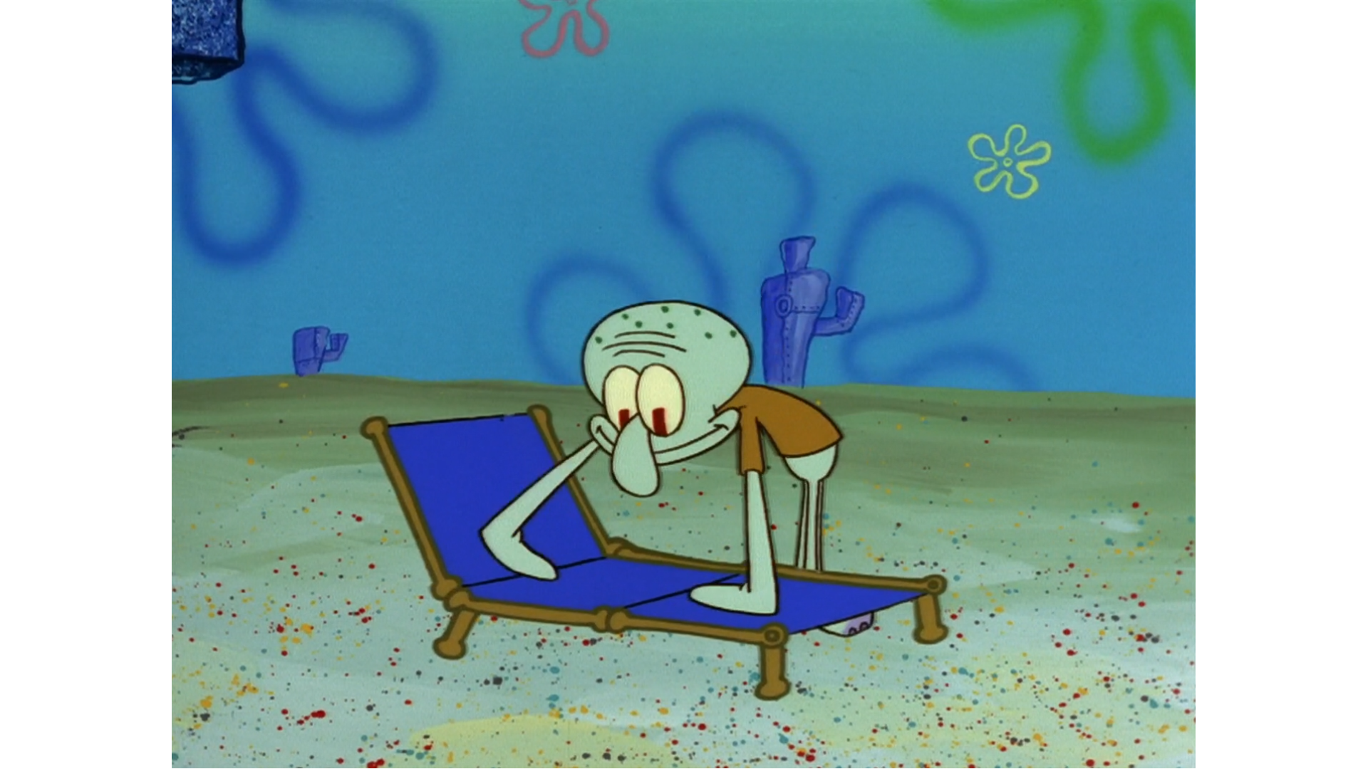
What kind of drawing utensil did they use to draw Squidward, a colored pencil?LARRY22 said:I think Season 9A looks different in terms of color saturation when comparing Amazon Instant Video/iTunes with the SpongeBuddyMania pictures, but thankfully, it's not too noticeable unless you compare them side-by-side.
Speaking of 'The Paper', who notices who bold and thick the outlines are for Squidward? I've never seen him outlined so bodly in Season 1, especially these pictures.


I also notice that on Nickelodeon, and the S1 DVD, the episode looks clean and has hardly any visual CRT artifacts.
I would've loved if the rest of the show looked like this.I think Season 9A looks different in terms of color saturation when comparing Amazon Instant Video/iTunes with the SpongeBuddyMania pictures, but thankfully, it's not too noticeable unless you compare them side-by-side.
Speaking of 'The Paper', who notices how bold and thick the outlines are for Squidward? I've never seen him outlined so bodly in Season 1, especially these pictures.


I also notice that on Nickelodeon, and the S1 DVD, the episode looks clean and has hardly any visual CRT artifacts.


I was talking about on Nickelodeon USA airings.Original Raw and Uncut said:Those episodes look normal. Minus a few dot crawls, Season 5 and Season 8 are the only seasons of the show where every episode looks normal
