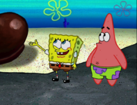
Pinned thread Art Style analysis in Spongebob and various other shows

Favorite art style

  • Markerbob

    Votes: 57 42.9%
  • Noodlebob

    Votes: 5 3.8%
  • Cubebob

    Votes: 2 1.5%
  • Normal

    Votes: 9 6.8%
  • Moviebob

    Votes: 13 9.8%
  • Modern SpongeBob Animation

    Votes: 9 6.8%
  • Cheekbob (season 6 version)

    Votes: 3 2.3%
  • Noodlebob knock-off (Season 4-5)

    Votes: 3 2.3%
  • 2004 produced early season 4 (season 3 lookalikes)

    Votes: 8 6.0%
  • Greenblattbob (Dying for Pie and Fear of a Krabby Patty)

    Votes: 24 18.0%

  • Total voters
    133
Not bad of an edit.

I must say for me, there is definitely a sort of unique style with Season 1. The Cel Animation makes it unique from the rest. I kinda like it, but Seasons 2 and 3 are also great. I say the animation has gone down for me around Seasons 9/10/11, where it started getting very wacky and cartoony. It's not bad or anything, I just prefer the calmer look that was previously around.
Do you like Season 9A animation?
 
Do you like Season 9A animation?
Season 9A isn't too bad, I think it might be more accurate to say Season 11+

I haven't watched much of the show beyond Season 9/10 so I can't exactly judge when the animation style changes to the wacky style that the show has right now.
 
I wonder if the brighter colors in Pranks a Lot were due to the mastering or a personal choice by the colorists at rough draft korea.
 
I wonder if the brighter colors in Pranks a Lot were due to the mastering or a personal choice by the colorists at rough draft korea.
Probably a mastering error, look at this picture, it looks like if they added a filter to the episodeScreenshot_20231129-170247_Gallery.jpg
 
Probably a mastering error, look at this picture, it looks like if they added a filter to the episodeView attachment 20104

The staff probably thought the colors were too dark in the rest of the season so they added a filter to Pranks a Lot. Honestly they should’ve left it alone. It doesn’t make sense to do it for one episode.

SpongeBob Meets the Strangler and Plankton’s Army also had brighter colors than the rest of the season but like I started previously, it works well with normal animation. With markerbob it looks so washed out. Mainly because normal animation lacks bold colored lines as well as the fact that normal animation has a more subdued color pallet than markerbob does.
 
Do you like Season 9A animation?
Yeah but it depends on the episode, it looks really good in Kenny The Cat but sometimes it's stiff. it's sort of weird because it's the only the 2nd time post-movie was in HD. (the other being truth or square) I think if it wasn't for Sponge out of Water, SpongeBob's animation wouldn't change since 9A.
 
Not bad of an edit.

I must say for me, there is definitely a sort of unique style with Season 1. The Cel Animation makes it unique from the rest. I kinda like it, but Seasons 2 and 3 are also great. I say the animation has gone down for me around Seasons 9/10/11, where it started getting very wacky and cartoony. It's not bad or anything, I just prefer the calmer look that was previously around.
I have some additional information to say. I haven't watched Spongebob's Middle Seasons in a while, so I needed to be reminded of what Spongebob looked like during that era. Mid-Season Spongebob's art style was mostly fine, though there was some gross-out here and there.

This is going to be very nitpicky, but one thing I will say that I didn't like during the mid-seasons is how they shaped Spongebob's Mouth. It's too narrow and small for me. I'd say it has a lot of emphasis on the cheek as well but most Spongebob Art Styles have that (It's just more prevalent in this era due to how his mouth is shaped). However, later seasons did fix the mouth, likely thanks to the thicker outlines and/or some scaling.
(Images sourced from Encylopedia Spongebobia.)
 
I have some additional information to say. I haven't watched Spongebob's Middle Seasons in a while, so I needed to be reminded of what Spongebob looked like during that era. Mid-Season Spongebob's art style was mostly fine, though there was some gross-out here and there.

This is going to be very nitpicky, but one thing I will say that I didn't like during the mid-seasons is how they shaped Spongebob's Mouth. It's too narrow and small for me. I'd say it has a lot of emphasis on the cheek as well but most Spongebob Art Styles have that (It's just more prevalent in this era due to how his mouth is shaped). However, later seasons did fix the mouth, likely thanks to the thicker outlines and/or some scaling.
View attachment 20125
They also made his face smaller and his nose too bigScreenshot_20231130-194929_Google.jpgScreenshot_20231130-195022_Gallery.jpg
 
Back
Top