Pinned thread Art Style analysis in Spongebob and various other shows

Favorite art style

  • Markerbob

    Votes: 59 43.4%
  • Noodlebob

    Votes: 5 3.7%
  • Cubebob

    Votes: 2 1.5%
  • Normal

    Votes: 9 6.6%
  • Moviebob

    Votes: 13 9.6%
  • Modern SpongeBob Animation

    Votes: 9 6.6%
  • Cheekbob (season 6 version)

    Votes: 3 2.2%
  • Noodlebob knock-off (Season 4-5)

    Votes: 3 2.2%
  • 2004 produced early season 4 (season 3 lookalikes)

    Votes: 8 5.9%
  • Greenblattbob (Dying for Pie and Fear of a Krabby Patty)

    Votes: 25 18.4%

  • Total voters
    136
Full Markerbob version 1 (can be distinguished most easily by season 2 colour palette but with SpongeBob being proportionately square):
As Seen on TV
I'm With Stupid
SpongeBob, Sandy, and the Worm
One Krabs Trash
Squid on Strike
SpongeGuard on Duty
Snowball Effect
Can You Spare a Dime?
My Pretty Seahorse

My Pretty Seahorse is the last markerbob episode to have the late season 2 color pallet. As Seen on TV, Can You Spare a Dime, and One Krabs trash have darker colors like the rest of season 3.
 
yeah, early markerbob is the one that looks the most like season 1, but it's my least favourite stage
------
I think the markerbob stages should be split into these to to make the major stages slightly more specific:

Prototype:
Hooky
Karate Choppers
Mermaid Man and Barnacle Boy II

Early (very similar to season 1 except digitally coloured):
Bossy Boots
Life of Crime*
Big Pink Loser
Imitation Krabs
*Life of Crime uses the transition markerbob design in a few scenes

Transition (the lines on SpongeBob's body are less rough, but he's still asymmetrical and rectangular):
I'm Your Biggest Fanatic
Dumped
Shanghaied
Pressure
Welcome to the Chum Bucket

Transition 2.0 (this bridges the gap between transition and full markerbob stages):
The Fry Cook Games

Full Markerbob version 1 (can be distinguished most easily by season 2 colour palette but with SpongeBob being proportionately square):
As Seen on TV
I'm With Stupid
SpongeBob, Sandy, and the Worm
One Krabs Trash
Squid on Strike
SpongeGuard on Duty
Snowball Effect
Can You Spare a Dime?
My Pretty Seahorse

Full Markerbob version 2 (cooler colour palette, slightly revised design):
The Bully
Krusty Krab Training Video
Squilliam Returns
New Student Starfish
Wet Painters

Full Markerbob version 3 (SpongeBob's inward facing cheeks become way more common):
Missing Identity
Mid-Life Crustacean
Krabby Land
The Camping Episode
Pranks A Lot

There's some markerbob during the song in Party Pooper Pants and the Krusty Krab scene in Ugh.
 
Screen Shot 2021-11-24 at 21.06.32.png
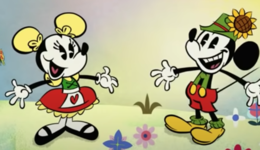
Mickey and Minnie in their hiking outfits in Season 1 and 2 style.
Screen Shot 2021-11-24 at 21.05.05.png
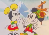
Mickey and Minnie in their hiking outfits in Season 3-present style.
 
Yeah, and the characters teeth always show when their mouths are open. Some Season 3 episodes look like a hybrid of the Season 1 and 2 style and the Season 3-present style. (From now on, I'm calling the first two seasons' style Geomouse, as the shapes look more geometric, and onwards Smoothmouse, for the more free and smoother movements)
Screen Shot 2021-11-24 at 21.14.39.png
 
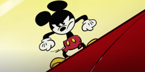
I like how Smoothmouse made Mickey more expressive.

Screen Shot 2021-11-25 at 10.20.25.png
Geomouse
Screen Shot 2021-11-25 at 10.21.07.png
Smoothmouse

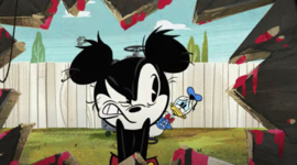
Look at how much more Mickey can express himself here. The second picture is from House Painters. Go to 1:44 in the video and you'll see how expressive Mickey is, it's like one emotion after another every second.
 
I like how Smoothmouse made Mickey more expressive.

View attachment 14227
Geomouse
View attachment 14228
Smoothmouse

Look at how much more Mickey can express himself here. The second picture is from House Painters. Go to 1:44 in the video and you'll see how expressive Mickey is, it's like one emotion after another every second.

What’s even more impressive is that show is flash animated. Typically only traditionally animated shows have different styles. Teen Titans Go for example is Flash and every episode looks exactly the same.
 
What’s even more impressive is that show is flash animated. Typically only traditionally animated shows have different styles. Teen Titans Go for example is Flash and every episode looks exactly the same.
It's probably one of the best examples of how to do Flash and make it look great. Some scenes are so well-animated that it almost looks feature-quality.
 
The first three seasons of Family Guy look like a 90's PBS cartoon, they do not look like an adult cartoon at all. Most adult cartoons have very ugly animation.
 
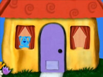
The Blues Clues' episode Joe's Clues use 3 styles at the same time!
Capture22.PNG.png
Most of it uses a combo of ClassicBlue and a style i call NeonBlue for some weird reason
Blue%27s_Clues_Mailbox_and_Blue.jpg
This scene is a scene showing Blue in the full style of NeonBlue
Jasmina_and_Blue.jpgCrayonBlue in season 6
 
Last edited:
i miss markerbob episodes, nowadays its the same thickness and backgrounds for every episode, they had a nice charm
Yeah, Season 4 was the last season to have many noticeably unique styles. You have Fear of a Krabby Patty with its own unique expressiveness. 2DD692E6-3099-4AD2-8FC3-763366151A22.jpegHave You Seen This Snail is also different with Patrick and Spongebob’s slightly odd body shapes/faces.86133DD9-5A32-410C-9B81-FE7D2D97A10F.jpeg
The Lost Mattress, Krabs Vs Plankton and Shell of A Man all look like Season 3 episodes. 4BF8C3EC-0118-432E-9A87-FCC472773CCC.jpegThe other early to mid season 4 episodes have a slightly more expressive style mostly using Spongebob’s bold eyebrows. 26AB2E2B-E70C-4984-A16A-E0154A049C2C.jpeg You have a few episodes that kinda use a mix of at least the Season 3 and Normal 4 styles like Good Neighbors and Mrs Puff You’re Fired. Additional to that there is also the late Season 4 episodes, starting with Hocus Pocus, that are even more stretchy and off model. 5823BAD3-4F84-4D64-9352-3009535C5678.jpegHonestly the most diverse season art style wise (even more than Season 2) and is honestly one of the reasons why it’s so fascinating and doesn’t feel modern or classic (though I feel it leans a bit towards Pre Movie as it plays out like a more fast paced Season 3 with animation usually about as expressive as the movie).
 
Last edited:
Yeah, Season 4 was the last season to have many noticeably unique styles. You have Fear of a Krabby Patty with its own unique expressiveness. View attachment 14244Have You Seen This Snail is also different with Patrick and Spongebob’s slightly odd body shapes/faces.View attachment 14238
The Lost Mattress, Krabs Vs Plankton and Shell of A Man all look like Season 3 episodes. View attachment 14237The other early to mid season 4 episodes have a slightly more expressive style mostly using Spongebob’s bold eyebrows. View attachment 14243 You have a few episodes that kinda use a mix of at least the Season 3 and Normal 4 styles like Good Neighbors and Mrs Puff You’re Fired. Additional to that there is also the late Season 4 episodes, starting with Hocus Pocus, that are even more stretchy and off model. View attachment 14242Honestly the most diverse season art style wise (even more than Season 2) and is honestly one of the reasons why it’s so fascinating and doesn’t feel modern or classic (though I feel it leans a bit towards Pre Movie as it plays out like a more fast paced Season 3 with animation usually about as expressive as the movie).

Season 5 is where all the episode start to look almost the same.
 
Yeah, Season 4 was the last season to have many noticeably unique styles. You have Fear of a Krabby Patty with its own unique expressiveness. View attachment 14244Have You Seen This Snail is also different with Patrick and Spongebob’s slightly odd body shapes/faces.View attachment 14238
The Lost Mattress, Krabs Vs Plankton and Shell of A Man all look like Season 3 episodes. View attachment 14237The other early to mid season 4 episodes have a slightly more expressive style mostly using Spongebob’s bold eyebrows. View attachment 14243 You have a few episodes that kinda use a mix of at least the Season 3 and Normal 4 styles like Good Neighbors and Mrs Puff You’re Fired. Additional to that there is also the late Season 4 episodes, starting with Hocus Pocus, that are even more stretchy and off model. View attachment 14242Honestly the most diverse season art style wise (even more than Season 2) and is honestly one of the reasons why it’s so fascinating and doesn’t feel modern or classic (though I feel it leans a bit towards Pre Movie as it plays out like a more fast paced Season 3 with animation usually about as expressive as the movie).


Nah, season 2 is still more diverse animation wise.
 
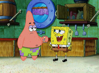
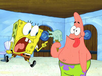
Have you noticed how ancient Pranks A Lot looks compared to Fear of a Krabby Patty
160.jpg269.jpg
I mean, look at that!

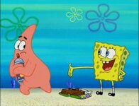
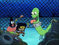
Also, I think the scenes in The Lost Mattress that take place in the dump look markerbob
442.jpg
Everything has colored lines. Sure, this is thin lines, but still. We could call this Dumpbob, Shellbob, or my personal favorite, Norkerbob.
 
Back
Top