Pinned thread Art Style analysis in Spongebob and various other shows

Favorite art style

  • Markerbob

    Votes: 58 43.3%
  • Noodlebob

    Votes: 5 3.7%
  • Cubebob

    Votes: 2 1.5%
  • Normal

    Votes: 9 6.7%
  • Moviebob

    Votes: 13 9.7%
  • Modern SpongeBob Animation

    Votes: 9 6.7%
  • Cheekbob (season 6 version)

    Votes: 3 2.2%
  • Noodlebob knock-off (Season 4-5)

    Votes: 3 2.2%
  • 2004 produced early season 4 (season 3 lookalikes)

    Votes: 8 6.0%
  • Greenblattbob (Dying for Pie and Fear of a Krabby Patty)

    Votes: 24 17.9%

  • Total voters
    134
i dont know if anyone has mentioned this but the digital shot in "jellyfish jam" has the correct colour palette for season 1, and kind of looks like season 2, this is probably what the show would have looked like if they switched to digital but kept the same art style
 

Attachments

  • mpv-shot0001.jpg
    mpv-shot0001.jpg
    328.5 KB · Views: 20
  • firefox_I8TejZkLiX.png
    firefox_I8TejZkLiX.png
    226.8 KB · Views: 20
i dont know if anyone has mentioned this but the digital shot in "jellyfish jam" has the correct colour palette for season 1, and kind of looks like season 2, this is probably what the show would have looked like if they switched to digital but kept the same art style

early s2 was literally digitally animated season 1
 
i dont know if anyone has mentioned this but the digital shot in "jellyfish jam" has the correct colour palette for season 1, and kind of looks like season 2, this is probably what the show would have looked like if they switched to digital but kept the same art style
Jellyfish Jam actually has two digitally animated scenes, the one you mentioned, and this one with the Pineapple bouncing
1687402823524.png
The one at the end with the Jellyfish always stuck out to me as a kid. The digital animation is so obvious and it just stands out so much when it's shown in between two cel animated shots.
 
Jellyfish Jam actually has two digitally animated scenes, the one you mentioned, and this one with the Pineapple bouncing
View attachment 18589
The one at the end with the Jellyfish always stuck out to me as a kid. The digital animation is so obvious and it just stands out so much when it's shown in between two cel animated shots.
yeah you go from a slightly noisy dark frame to a bright clean animation, both these digital animation test things look a whole lot better then the one in sb-129
 
yeah you go from a slightly noisy dark frame to a bright clean animation, both these digital animation test things look a whole lot better then the one in sb-129

They wanted Spongebob's pineapple to blend in with the rest of the background, which is why they made it digitally animated. In MM&BB the shot of Spongebob's house was cel animated which makes it not blend in with the rest of the background:


1687452585097.png
 
It's pretty uncommon for cel animated shows to have scenes that are digitally edited/animated. The season 2 finale of Dexter's Lab had a scene that was digitally edited:
1687452773013.png
 
Jellyfish Jam actually has two digitally animated scenes, the one you mentioned, and this one with the Pineapple bouncing
View attachment 18589
The one at the end with the Jellyfish always stuck out to me as a kid. The digital animation is so obvious and it just stands out so much when it's shown in between two cel animated shots.
Also had it in rock bottom
 
I traced over this scene from sb-129 seeing what it would look like with the season 3 colour pallete (forgot the dots on his head)
I did something similar but turning season 2 color palette into season 1's
 
I traced over this scene from sb-129 seeing what it would look like with the season 3 colour pallete (forgot the dots on his head)
Can i just ask how you de-noised the backgrounds?
 
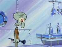
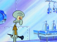
I noticed Born Again Krabs is a weird blend of normal animation and markerbob
The Backgrounds are from Markerbob, The Color palette is the same as Markerbob
But the characters itself seem to be normal animation
1687958095582.png
View attachment 18621
1687958262974.png
Obviously the Markerbob Background Team worked on this, But for some reason Markerbob has always had Markerbob backgrounds and never borrowed
from normal animation
Here's what normal animation backgrounds are supposed to look like
1687958429068.png
 

Attachments

  • 1687958240692.png
    1687958240692.png
    673.6 KB · Views: 8
Now here's Markerbob Backgrounds
1687958617477.png

Now here's Born Again Krabs
1687958748933.png
Interestingly the same case happened with Plankton's Army where normal animation utilizes Markerbob backgrounds
1687958884398.png
 

Attachments

  • 1687958716068.png
    1687958716068.png
    566.7 KB · Views: 6
I noticed Born Again Krabs is a weird blend of normal animation and markerbob
The Backgrounds are from Markerbob, The Color palette is the same as Markerbob
But the characters itself seem to be normal animation
View attachment 18619
View attachment 18621

Obviously the Markerbob Background Team worked on this, But for some reason Markerbob has always had Markerbob backgrounds and never borrowed
from normal animation
Here's what normal animation backgrounds are supposed to look like
What shall we name this? MarkerNoodle? NoodleMarker? Markernormal? CubeMarker?
 
I noticed Born Again Krabs is a weird blend of normal animation and markerbob
The Backgrounds are from Markerbob, The Color palette is the same as Markerbob
But the characters itself seem to be normal animation
View attachment 18619
View attachment 18621
View attachment 18622
Obviously the Markerbob Background Team worked on this, But for some reason Markerbob has always had Markerbob backgrounds and never borrowed
from normal animation
Here's what normal animation backgrounds are supposed to look like
View attachment 18623

The krusty krab looks more angular looking in markerbob episodes:

1687975326560.png

Normal animation Krusty Krab has softer edges (left) markerbob one looks sharper (right)
 
Back
Top