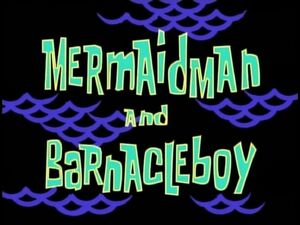
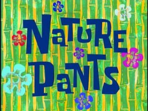
Font: Like always, the font is bland and not very interesting whatsoever.
+1
Color: The color with the light blue and purple along with black looks pretty nice.
+3
Background: The dark background has smooth lines that makes it look good while not entirely interesting.
+2
Uniqueness: Considering 4 other title cards following this one will look exactly the same, this title card is only unique in the respect of being the first one of the kind.
+2
Final Score: 8 points The title card looks nice despite following ones that are exactly the same later on.
D
Font: The background is large and looks relatively organized.
+2
Color: My 2 favorite colors mixed together makes something quite pleasing to my eyes at least.
+3
Background: The background is the usual "stock pattern" that has nothing special, but the dark tone is nice.
+2
Uniqueness: While the card is pleasing to the eye, it's not unique in really any way at all.
+1
Final Score: 8 points The title card has some great colors, but the usual season 1 lack of originality in the card.
D
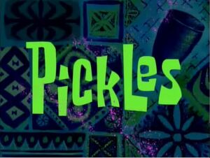
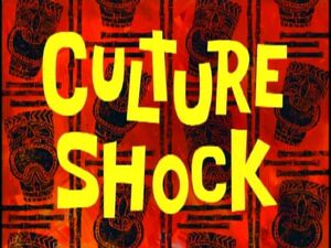
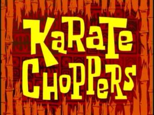
Font: The font is very boring and normal with no outstandingness.
+1
Color: The orange and the light blue doesn't look like the best in my opinion, but it's at least complimentary.
+2
Background: The light flowers and tiki heads is very, very boring.
+1
Uniqueness: The tiki heads is nice, but that's the farthest I can go with it.
+2
Final Score: 6 points The title card is VERY boring and not interesting at the slightest.
F
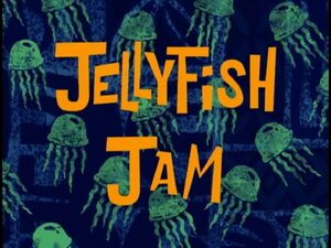
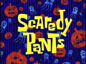
Font: The font doesn't look amazing, but the way it's assembled is strangely charming.
+2
Color: The blue background and orange text is very pleasing on the eyes and complimentary.
+4
Background: The dark blue with jellyfish is nice and charming.
+3
Uniqueness: The uniqueness is lower because of the carbon copy of Jellyfishing, but the jellyfish are still a nice touch.
+2
Final Score: 11 points One of the better title card of the season, it's very charming even if it's a copy of Jellyfishing.
D
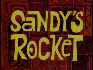
Font: The surprisingly unique font on this title card, while a font that is usually used, looks amazing in the way it's assembled on the title card.
+4
Color: The yellow upon red looks very "extreme" looking and fits well with the episode.
+3
Background: The background is a basic background, but it still compliments well.
+2
Uniqueness: The font is very unique prior to other fonts, but that's sadly it.
+2
Final Score: 11 points The font on this title card is a very large highlight for sure.
D
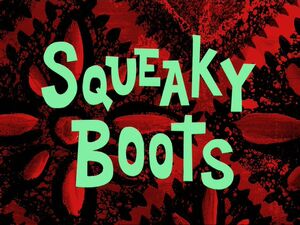
Font: The font isn't as used as others, but that doesn't make up for it being simplisticly ugly.
+2
Color: The green and red usually works well, but the overall dullness of the scheme isn't great.
+2
Background: The background is rare, but it is sadly VERY ugly nevertheless.
+1
Uniqueness: The overall title card is the ultra-typical title card that's panned around season 1.
+1
Final Score: 6 points Sadly, this title card, especially, the color scheme, is very very ugly and is spoiled milk for your eyes.
F
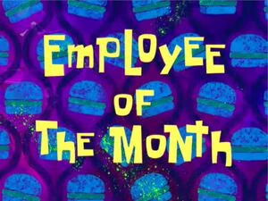
Font: Honestly, the font is jumbled and usual, despite the nice color.
+1
Color: The very bright color scheme, unlike the one in Pizza Delivery, is extremely pleasant to the eyes.
+4
Background: The background is innocent and light in a good way, once again, unlike Pizza Delivery.
+3
Uniqueness: The title card may be very bright, but it's not the outstandingly unique title card.
+2
Final Score: 10 points The colors may be wonderfully bright, but the innocence of the title card doesn't excuse it being a tad boring.
D
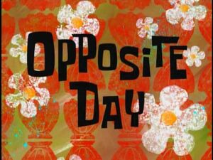
Font: The text is very dull, and the fact that it's plain black doesn't help manners.
+1
Color: Plain black among painfully ugly white, yellow, and dull orange/brown is extremely hard to look at.
+1
Background: The background is super basic and nothing fun at all.
+1
Uniqueness: This title card isn't unique at all, and it isn't interesting in any way.
+1
Final Score: 4 points This title card is the epitome of ugly title cards. Its extremely ugly font and colors make it one of the worst ever.
F
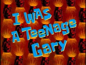
Font: The font is surprisingly unique, but still a tad boring despite that.
+2
Color: Like Sandy's Rocket, the yellow on red looks very eye-pleasing.
+3
Background: The background is basic and nothing special, but the tikis are a bit 'odd.'
+2
Uniqueness: While pleasing on the eye, the title card is hardly unique.
+1
Final Score: 8 points Despite the lack of uniqueness whatsoever, this title card is still pretty pleasing on the eyes.
D
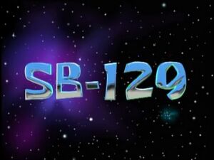
Font: The font isn't anything special, but the largeness and the contrast to the background really catches your eye in a good way.
+3
Color: The light green/blue/light green among the plain black background shouldn't look awesome, but the high amount of contrast really does.
+3
Background: The pitch black background sadly is very plain, but is still in good contrast.
+2
Uniqueness: While the black background is very plain, it's very unique compared to the jumbles of crap that a lot of the season 1 title cards are.
+3
Final Score: 11 points The high contrast makes this title card drastically different from others of the season, and that's for the best.
D
Best Title Cards So Far...
=1= Bubblestand
(12 points)
=1= Jellyfishing
(12 points)
=3= Sandy's Rocket
(11 points)
=3= F.U.N.
(11 points)
=3= Jellyfish Jam
(11 points)
Worst Title Cards So Far...
1. Opposite Day
(4 points)
2. Boating School
(5 points)
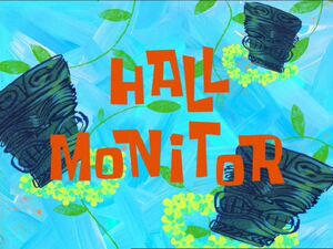
=3= Naughty Nautical Neighbors
(6 points)
=3= Tea at the Treedome
(6 points)
=3= Squeaky Boots
(6 points)
=3= Hall Monitor
(6 points)


(Beautiful, unique font that is related to the episode itself+blue, your favorite color)
(You said that it's your favorite title card not a long time ago)
(I thought about Fear of a Krabby Patty as a possible nominee, but the colors in this one are much more pleasant to the eye)