Worst Title Cards

Z-Dogg64

Floating Shopping List
Joined
Mar 18, 2016
Messages
108
Points
126
Gone.png

Creepy. The barren area with just the word "gone" complimented by the standard cheery background music creates this unsettling feel.
SpongeBob%27s_Last_Stand.png

This one sucks primarily because of the background music. For such an epic name and a big special, who's bright idea was it to put standard background music in?
 
The inSPONGEiac is one of the creepiest title cards...
And Larry's Gym's title card looked bland and the font didn't really go with the episode
 
That's a tough one because I like most of them

I guess any title cards with unfitting music like "One Coarse Meal"

I remember thinking the title card for "Tutor Sauce" was kinda generic and bland.
 
I don't think I have any, although reusing title card backgrounds are a little lazy.
 
This would be OK if it weren't for that cheap stock font they used for "Welcome to the". It stands out like a sore thumb and kinda ruins the card for me.
Never mind, this is the worst title card. Looking back, I don't know why I said Selling Out was bad.
 
Season 9 may have the blandest and most generic title cards, but season 6 has the ugliest ones. Not just for the music repetition, but just because they're ugly

UGLY

Other ones I don't like: The Smoking Peanut, Sailor Mouth (I don't get why people love it), Doing Time, The Thing, Breath of Fresh Squidward, Hide and Then What Happens?, The Googly Artist, Barnacle Face, Bubble Troubles, Restraining SpongeBob, For Here or To Go, Larry's Gym, Two Thumbs Down
 
"Once Bitten". The title card music ("Marching to Honolulu" by Kapono Beamer) is really unfitting. Instead, I'd suggest something like this:


Also, I agree with you on "Gone". The title card is too cheery for the premise for that episode. This is better for that title card:


MrTortellini00 said:
I like the font on that "Plankton's Regular" title card to be honest.
 
Season 9 may have the blandest and most generic title cards, but season 6 has the ugliest ones. Not just for the music repetition, but just because they're ugly

UGLY

Other ones I don't like: The Smoking Peanut, Sailor Mouth (I don't get why people love it), Doing Time, The Thing, Breath of Fresh Squidward, Hide and Then What Happens?, The Googly Artist, Barnacle Face, Bubble Troubles, Restraining SpongeBob, For Here or To Go, Larry's Gym, Two Thumbs Down
Actually, the first half of season 9 has pretty good title cards like Squirrel Record, Patrick-Man, Jailbreak, Evil Spatula, Safe Deposit Krabs, Plankton's Pet, Seance Shmeance. But in the second half, it all went downhill.
 
In terms of appearance, here are some bad ones:

  • Inspongeiac
  • It's A SpongeBob Christmas
  • Trenchbillies
  • Pet Or Pests
  • Two Thumbs Down
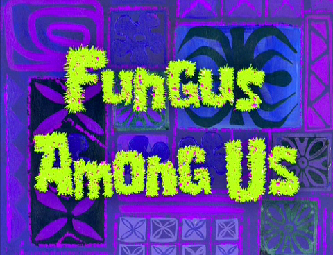
  • Fungus Among Us
  • Plankton's Regular
  • F.U.N
  • A Day Without Tears
  • Are You Happy Now?
  • Prehibernation Week
  • The Krusty Sponge
  • Fiasco
  • The Secret Box
 
RomNick said:
Actually, the first half of season 9 has pretty good title cards like Squirrel Record, Patrick-Man, Jailbreak, Evil Spatula, Safe Deposit Krabs, Plankton's Pet, Seance Shmeance. But in the second half, it all went downhill.
Eh, I don't think it ever went downhill, the title cards in the first half weren't that original either IMO.
 
MrTortellini00 said:
Eh, I don't think it ever went downhill, the title cards in the first half weren't that original either IMO.

Oh, yeah. Totally not original. With these very creative fonts and backgrounds.
 
Squid's Visit's title card should have a creepy, suspenseful theme, Patty Caper's should have a detective-like tune(or maybe Spy Buddies' tune) and Are You Happy Now's should be the theme that plays during the depression segment.
 
Back
Top