You are using an out of date browser. It may not display this or other websites correctly.
You should upgrade or use an alternative browser.
You should upgrade or use an alternative browser.
The SB Movie 2 Poster!!!!
- Thread starter Cha
- Start date
Jibbix
Balloon Traveler
- Joined
- Feb 7, 2012
- Messages
- 1,130
- Points
- 2,986
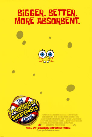
I think I realize it now. This really is happening. The poster is similar to the first movie's, here:

I didn't want to admit it at first. I was fearful for the movie at first and didn't want to be let down. But I can't help myself anymore. I'm. So. FREAKIN' EXCITED FOR THIS. Bring it on, Sponge! 2014 can't come soon enough.

I didn't want to admit it at first. I was fearful for the movie at first and didn't want to be let down. But I can't help myself anymore. I'm. So. FREAKIN' EXCITED FOR THIS. Bring it on, Sponge! 2014 can't come soon enough.
Cha
I love SBM
- Joined
- Nov 25, 2011
- Messages
- 6,642
- Points
- 46,976
I think I realize it now. This really is happening. The poster is similar to the first movie's, here:

I didn't want to admit it at first. I was fearful for the movie at first and didn't want to be let down. But I can't help myself anymore. I'm. So. FREAKIN' EXCITED FOR THIS. Bring it on, Sponge!
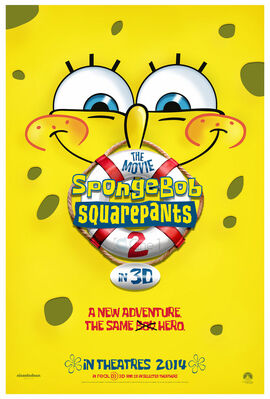
I know! This new poster is so alike! The new one even says "The Same
DadMom AngryPants
Hi, I'm normal.
- Joined
- Nov 24, 2009
- Messages
- 9,319
- Points
- 78,476
I originally saw this when it was uploaded to deviantArt in March, but I must admit I kind of skimmed over it assuming it was unofficial because it just seemed way too early for a promo poster to be revealed.
http://browse.deviantart.com/?qh=§ion=&q=spongebob+movie+2+poster#/d4u7349
(Description translates as "Another poster I did for cine1.com.ar hope you like it, greetings.")
I still can't work out if cine1.com.ar is a legitimate source or not; whether this guy was actually commissioned by Nickelodeon to make a poster, or whether he was asked by this website to make one.
It does look pretty real, but I'd still take it with a grain of salt until we can confirm it either way.
My thoughts on the poster (whether it's legit or not):
- I love how similar it is to the first movie's poster.
- I also love the tagline.
- I seriously hope it's not going to be in 3D. In fact, the "in 3D" bit is what is making me question this poster's legitimacy. Unless there is some crazy way of making a 2D-animated movie 3D, it implies that they're going to CGI-ify the Spongebob universe. Why would they do that when Spongebob has always been 2D? It doesn't make sense to me.
- I also hope that isn't the real name. "The Movie - Spongebob Squarepants - 2" is horrible. It just sounds so clumsy.
- Joined
- Dec 20, 2005
- Messages
- 11,014
- Points
- 108,986
- Favorite Character
- Patrick
High Quality: http://fc07.devianta...ent-d4u7349.jpg
The guy who made it put it on deviant art... no official release from nick on it though... not sure if it is actually official http://jphomeenterta...t.com/#/d4u7349
Pretty cool :)
EDIT: dang it DMAP... I'll just climb back into my hole :P
Edit 2: based on his other works and what his descriptions are on those... I'm going to say this is unofficial with certainty
Jibbix
Balloon Traveler
- Joined
- Feb 7, 2012
- Messages
- 1,130
- Points
- 2,986
I dunno if The Lion King was re-released over there in the UK, but it's possible. The Lion King (a 2-D movie) managed to pop out of the screen just like a CGI movie would. It could work for Spongebob (the show has always used psuedo CGI; watch Good Neighbors to prove my point). And, while the poster might not be real, it's still awesome. I still question the "fakeness" of this, because it uses the actual "Spongebob font" instead of the fake font everyone uses. But, if the poster isn't real, I hope the real one is as good (and respective of it's roots) as this one was.- I seriously hope it's not going to be in 3D. In fact, the "in 3D" bit is what is making me question this poster's legitimacy. Unless there is some crazy way of making a 2D-animated movie 3D, it implies that they're going to CGI-ify the Spongebob universe. Why would they do that when Spongebob has always been 2D? It doesn't make sense to me.
SpongeRoadie UK
Vomit Boy
- Joined
- Jan 6, 2012
- Messages
- 3,623
- Points
- 15,476
yeaaaaahhh :xdmagic:
Mavaxis Starburner
I love SBM
- Joined
- May 14, 2011
- Messages
- 1,925
- Points
- 4,486
Sigh its in 2014 lol
PhilipB
Sussudio Enthusiast
- Joined
- Apr 3, 2005
- Messages
- 5,873
- Points
- 34,476
Ugh... it has that post season 4 style about it, doesn't it. I really don't like this real-cutey, realistic art they do now. I prefer the sort of simpler basic style you see in the original movie poster. There's something so very, well, scary about this new poster, compared to the poster for the original movie.
Jibbix
Balloon Traveler
- Joined
- Feb 7, 2012
- Messages
- 1,130
- Points
- 2,986
Normally, I'd be inclined to agree, but not here. This is the simplest the show's official art has been since the early Season 4 DVD Covers and Runaway Roadtrip's cover. It is simple; there's just some light shading added. To me, it doesn't look over-cute or realistic or scary. It's perfectly fine.Ugh... it has that post season 4 style about it, doesn't it. I really don't like this real-cutey, realistic art they do now. I prefer the sort of simpler basic style you see in the original movie poster. There's something so very, well, scary about this new poster, compared to the poster for the original movie.
And besides, if we had gotten this movie three years ago (during Season 6), we would've gotten this for a poster:

"He's back and nastier than ever. Coming November 2009."
And I'm absolutely sure that no one wants that. :P
Bugs Bunny
That Screwy Wabbit
- Joined
- Aug 23, 2011
- Messages
- 420
- Points
- 726
I'm actually with PhiliB. If you actually compare season 4 and season 3's animation style, you'll notice quite a different.
Jibbix
Balloon Traveler
- Joined
- Feb 7, 2012
- Messages
- 1,130
- Points
- 2,986
You're absolutely right. The animation got progressively stiffer and worse until Season 6, and in Season 7, it got better. Season 8's animation is becoming looser. But, Phillip was talking more about the official art. And I agree. Season 4+'s official art is weird, and Psuedo-3D. It's just akward. However, this isn't so bad. It's just some light shading. It's not bad whatsoever. It's pretty much the cover from Bikini Bottom Adventures compared to the cover of Seascape Capers. Is this:I'm actually with PhiliB. If you actually compare season 4 and season 3's animation style, you'll notice quite a different.

Really so "terrible and scary" compared to this:

ssj4gogita4
Squidward Tortellini
- Joined
- Apr 7, 2004
- Messages
- 24,934
- Points
- 273,986
- Favorite Character
- Squidward
[y]gmlR5eG9zP4[/y]It's too bad we'll all be dead in 2014.

