
I know what you're thinking. Boring, right? But no. In my opinion, this is a very smart move which makes the station look more professional.
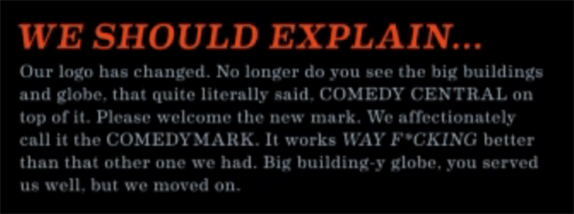
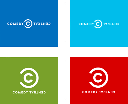
The quick reactions yesterday after the logo was unveiled have been mostly negative. Surprise, surprise, huh? The two basic complaints are that a) its boring andit looks like the copyright symbol. Both complaints are typical knee-jerk reactions that are very undeserved for a channel that is very smart about its programming and positioning. So, lets argue. The old logo was certainly not boring. It had pow and it had wow. We had grown accustomed to it. But when you think about the place Comedy Central occupies in culture and media, its more akin to CNN, ESPN, or any of the major networks. The old logo simply can not be used as an endorsing mark for what the channel represents the logo was too cartoonish. Like showing up to work at a Fortune 100 company in a Hawaiian shirt. The new logo is simple not boring, a big difference it is easier to reproduce across multiple media and it still has a small wink of humor in the Central being flipped upside down.
In its simplicity, the two Cs form what some find an offensive copyright mark. Well, thats pretty smart if you ask me. Because its obvious they are co-opting it and making it work in their favor. In the video and the little character logos directly above the text, you can see them using the CC icon exactly like a copyright symbol, placing it to the top right of all their characters, from John Stewart to Doctor Zoidberg. While the copyright symbol demarcates as hands off, Comedy Centrals logo demarcates as this is funny ::dolphin noise::. Comedy is about taking it the familiar and twisting it, and thats exactly what this logo is doing.

Video here: http://www.comedycentral.com/jan2011/
Link to article: http://www.underconsideration.com/brandnew...still_funny.php
Can't wait to see this used. Looks very good.