Favorite title cards

The Appetizer

shapes and noises
Joined
Aug 16, 2015
Messages
4,138
Reaction score
3,064
Location
Itchy and Scratchy Land
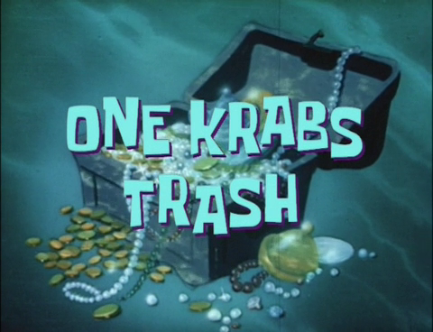
Which episode's title cards are your favorites? Which title cards strike you as visually interesting?

The ones I find interesting:


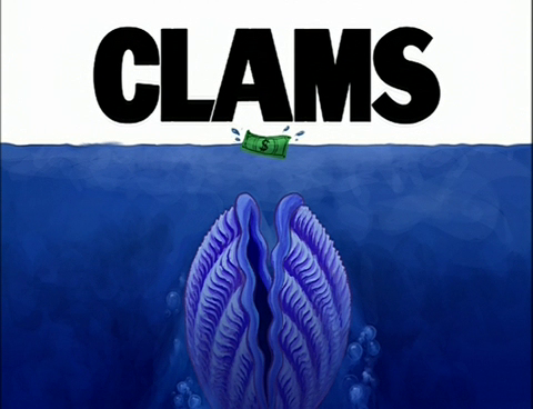
A "Jaws" parody, front and center. This kind of stuff tickles my fancy.


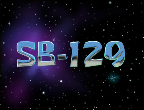
Very different from all the other SB title cards, being very plain. I like it.


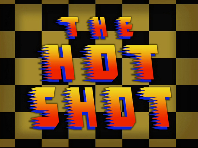
Groovy lettering that perfectly fits the episode's content.


Because title cards are always better if they're animated.
 
205_thumb.jpg
549_thumb.jpg
3_thumb.jpg
2_thumb.jpg


The first one is pretty self-explanatory. I like Oral Report and Frankendoodle because I like doodle collages, and One Krabs Trash is cool because of the animation.
 
pOXHwaP.jpg
Its not a title card but a time card. It looks "radical" and they should use the design as a actual title card in a episode some day.
 
S1:
Besides the obvious SB-129, FUN has one I loved how they had the patterned font with the black background, very clever!

S2:
Prehibernation Week takes the cake. A very awesome title card. The moving background compliments the simple text.

S3:
Clams wins this round! Great parody title card.

S4:
All that Glitters. Although I hate the episode, the title card looks very attractive.

S5:
Friend or Foe. Depicts the episode nicely, and I like how Krabs and Plankton are both smiling.

S6:
The winner is.....House Fancy! I am drawn to the beauty and sophistication of the title card and font.

S7:
Spongebob's Last Stand. The creativity put into the title card is marvelous.

S8:

It's a Spongebob Christmas! Very cute font, and the backgrounds depicts the nature of the episode as well

S9:
Séance Schmeance's title card is glowy and very artistic!
 
I always liked Krab Borg because of the robot voice. And it looks really interesting and detailed. I wish it was animated though, they could have made the lights blink or something.

 
Back
Top