Yes. This is a topic I don't think anyone has EVER done on this site before. Well, I will. Episode by episode, I will briefly review each title card of all SB episodes. This is the format it will follow:
[picture of title card]
Font: explains size, spacing, and design of font (# of points out of 5)
Color: explains color scheme of title card (# of points out of 5) NOTE* - this rating will probably correspond with my favorite colors, so that's a warning
Background: explains design of background of title card (# of points out of 5)
Uniqueness: explains how unique title card is (# of points out of 5) NOTE* - the bottom line would be the kind of title cards that have a very basic tropical-looking background with tropical-looking text OTHER NOTE* - this rating will also correspond with if the title card has anything to do with the episode
Animation (extra credit): explains if any visible animation is on the title card (# of points out of 2) NOTE* - this part will only occur if the title card has any animation at all OTHER NOTE* - 1 points out of 2 means the animation is either brief or not good-looking 2 out of 2 means the animation is actually highly noticeable and fun to look at
MORE NOTES
- I don't care about the music of the title card.The music is usually bland of simple. If the music really IS interesting enough, it will correspond with the uniqueness rating.
- Personal opinion about the episode itself doesn't matter in ANY WAY WHATSOEVER.
- The top score a title card can possibly get is 20 points. Even with the extra credit, no episode is perfect. No episode can possibly have 18 points in the first part than an extra 2 with extra credit. I don't see it happening.
Rating System
4 - 7 points - very hard to look at ; not charming in any way
8 - 11 points - average ; not charming or ugly
12 - 15 points - charming ; easy on the eyes
16 - 18 points - goes the extra mile ; very fun to look at
19 - 20 points - some of the best title cards the show has ever seen
Well, I might as well do my first one on Help Wanted, Reef Blower, and Tea at the Treedome

Font: The font is fairly basic. It is quite jumbled in a unique manner, but it is not extremely pleasant to look at. +2
Color: The card is a mish-mash of different shades of brown-orange, blue, and pasty cream yellow. It's unpleasant and hard on the eyes. +1
Background: The background looks like cinnamon rolls with blue lines covering it. The background looks random, but sort of charming for an odd reason. +3
Uniqueness: The whole title card isn't very unique. It's the typical tropical title card simply with a bit of a different background.+1
Total Score: 7 points This title card isn't just average. The font and the color scheme make it upright hard to look at. F
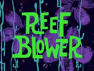
Font: The font is the same as Reef Blower, but the difference is that it seems a bit more curvy and smooth. +3
Color: The color scheme is pretty. The green, water blue and purple on the black background makes it feel flowery. +4
Background: The background is simply purple flowers with streaks of water covering it while all of it is pasted atop pitch black. The background isn't extraordinary, but it's nicer to look at than Help Wanted. +2
Uniqueness: The background is another one of those that feels generic. While it's nice to look it, there are no outstanding qualities on it. +1
Total Score: 10 points While the color scheme is pretty, that's the best part of the whole title card. D
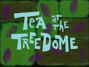
Font: The font is another one of those fonts that seem jumbled and not too nice on the eyes. +1
Color: The color scheme involves light blue font, purple acorns and barf-green on the background. The color fails to impress. +1
Background: The background has purple acorns along with a green background. The background's form is definitely different. +2
Uniqueness: The title card looks a bit generic at first, but the acorns make it correspond with the episode. +2
Total Score: 6 points Other than the acorns, this title card has no redeeming qualities. The barf green makes it horrendous to look at. F
As a whole, beginning title cards from the show weren't amazing. They never catch my eye, and 2 of them are actually ugly. Hopefully, the title cards get better over the course of the show, which they actually do.
What do you guys think? What's your judgement on the title cards?
[picture of title card]
Font: explains size, spacing, and design of font (# of points out of 5)
Color: explains color scheme of title card (# of points out of 5) NOTE* - this rating will probably correspond with my favorite colors, so that's a warning
Background: explains design of background of title card (# of points out of 5)
Uniqueness: explains how unique title card is (# of points out of 5) NOTE* - the bottom line would be the kind of title cards that have a very basic tropical-looking background with tropical-looking text OTHER NOTE* - this rating will also correspond with if the title card has anything to do with the episode
Animation (extra credit): explains if any visible animation is on the title card (# of points out of 2) NOTE* - this part will only occur if the title card has any animation at all OTHER NOTE* - 1 points out of 2 means the animation is either brief or not good-looking 2 out of 2 means the animation is actually highly noticeable and fun to look at
MORE NOTES
- I don't care about the music of the title card.The music is usually bland of simple. If the music really IS interesting enough, it will correspond with the uniqueness rating.
- Personal opinion about the episode itself doesn't matter in ANY WAY WHATSOEVER.
- The top score a title card can possibly get is 20 points. Even with the extra credit, no episode is perfect. No episode can possibly have 18 points in the first part than an extra 2 with extra credit. I don't see it happening.
Rating System
4 - 7 points - very hard to look at ; not charming in any way
8 - 11 points - average ; not charming or ugly
12 - 15 points - charming ; easy on the eyes
16 - 18 points - goes the extra mile ; very fun to look at
19 - 20 points - some of the best title cards the show has ever seen
Well, I might as well do my first one on Help Wanted, Reef Blower, and Tea at the Treedome
Font: The font is fairly basic. It is quite jumbled in a unique manner, but it is not extremely pleasant to look at. +2
Color: The card is a mish-mash of different shades of brown-orange, blue, and pasty cream yellow. It's unpleasant and hard on the eyes. +1
Background: The background looks like cinnamon rolls with blue lines covering it. The background looks random, but sort of charming for an odd reason. +3
Uniqueness: The whole title card isn't very unique. It's the typical tropical title card simply with a bit of a different background.+1
Total Score: 7 points This title card isn't just average. The font and the color scheme make it upright hard to look at. F
Font: The font is the same as Reef Blower, but the difference is that it seems a bit more curvy and smooth. +3
Color: The color scheme is pretty. The green, water blue and purple on the black background makes it feel flowery. +4
Background: The background is simply purple flowers with streaks of water covering it while all of it is pasted atop pitch black. The background isn't extraordinary, but it's nicer to look at than Help Wanted. +2
Uniqueness: The background is another one of those that feels generic. While it's nice to look it, there are no outstanding qualities on it. +1
Total Score: 10 points While the color scheme is pretty, that's the best part of the whole title card. D
Font: The font is another one of those fonts that seem jumbled and not too nice on the eyes. +1
Color: The color scheme involves light blue font, purple acorns and barf-green on the background. The color fails to impress. +1
Background: The background has purple acorns along with a green background. The background's form is definitely different. +2
Uniqueness: The title card looks a bit generic at first, but the acorns make it correspond with the episode. +2
Total Score: 6 points Other than the acorns, this title card has no redeeming qualities. The barf green makes it horrendous to look at. F
As a whole, beginning title cards from the show weren't amazing. They never catch my eye, and 2 of them are actually ugly. Hopefully, the title cards get better over the course of the show, which they actually do.
What do you guys think? What's your judgement on the title cards?